Tax Center
Tax Center
Role: UX/UI Designer & Researcher
Technique: Session recordings
Role: UX/UI Designer & Researcher
Technique: Session recordings
Role: UX/UI Designer & Researcher
Technique: Session recordings

EXECUTIVE SUMMARY
During each tax season, investors frequently reached out to the Customer Care team for assistance locating their tax files, tracking how many files they had received, understanding the total expected, and anticipating when remaining files would arrive.
To gain deeper insight into these investor inquiries, I collaborated closely with the Customer Care team and analyzed session recordings to identify usability challenges and friction points in the user experience.
As a result of the improvements, investor support tickets decreased by 51%, and CSAT survey scores exceeded the target by 8%, demonstrating a significant enhancement in both usability and user satisfaction.
Crowd Street users invest in commercial real estate projects. Real estate employees must review and approve hundreds of offers to verify documentation, confirm payments, and finalize contracts.
The previous offer approval workflow was highly unintuitive. Employees relied heavily on one-on-one support to remember the correct steps, filters, and task sequences. I conducted a personas workshop to understand the key personas, their goals, and pain points. I also conducted a user journey map to further understand the current end-to-end workflow and uncover usability gaps. Furthermore, I facilitated a “How Might We” + Crazy 8’s brainstorming sessions to simplify the offer approval flow. Lastly, I interviewed real estate employees to refine the new design interactions and layout.
The redesign reduced the average time on task by 50%, significantly improving efficiency and clarity. Additionally, the new “Approve Document” component proved highly adaptable, being successfully implemented across another three different projects, demonstrating its scalability and design versatility.
Crowd Street users invest in commercial real estate projects. Real estate employees must review and approve hundreds of offers to verify documentation, confirm payments, and finalize contracts.
The previous offer approval workflow was highly unintuitive. Employees relied heavily on one-on-one support to remember the correct steps, filters, and task sequences. I conducted a personas workshop to understand the four key personas, their goals, and pain points. I also conducted a user journey map to further understand the current end-to-end workflow and uncover usability gaps. Furthermore, I facilitated a “How Might We” + Crazy 8’s brainstorming sessions to simplify the offer approval flow. Lastly, I interviewed real estate employees to refine the new design interactions and layout.
The redesign reduced the average time on task by 50% , significantly improving efficiency and clarity. Additionally, the new “Approve Document” component proved highly adaptable, being successfully implemented across another three different projects, demonstrating its scalability and design versatility.
Problem statement
Investors struggled to find their tax files, to know how many files had been received, the total expected, and when remaining files would arrive. This lack of visibility created frustration and led to frequent inquiries to Customer Care during tax season.
Investors struggled to find their tax files, to know how many files had been received, the total expected, and when remaining files would arrive. This lack of visibility created frustration and led to frequent inquiries to Customer Care during tax season.
Investors struggled to find their tax files, to know how many files had been received, the total expected, and when remaining files would arrive. This lack of visibility created frustration and led to frequent inquiries to Customer Care during tax season.
RESEARCH
Audit & Initial Findings
Audit & Initial Findings
Audit & Initial Findings
First of all, I contacted the customer care team to understand the most common questions regarding tax files:
How many tax documents have I received?
How many will I receive?
When will I receive the remaining documents?
Then, I continue by checking any metrics available and by reviewing the existing page to identify basic usability issues:
First of all, I contacted the customer care team to understand the most common questions regarding tax files:
How many tax documents have I received?
How many will I receive?
When will I receive the remaining documents?
Then, I continue by checking any metrics available and by reviewing the existing page to identify basic usability issues:
First of all, I contacted the customer care team to understand the most common questions regarding tax files:
How many tax documents have I received?
How many will I receive?
When will I receive the remaining documents?
Then, I continue by checking any metrics available and by reviewing the existing page to identify basic usability issues:

Multiple pages must be viewed to answer the 3 investor's questions:
On the Tax Documents page, they can view the files they’ve already received.
On the Portfolio page, investors can see the expected delivery dates of tax documents.
They have to view each investment to know what investment has a missing tax file.
Clarity session recordings show that investors prefer downloading documents in bulk rather than one at a time.
The current Tax Documents page feels overwhelming due to excessive filters and too much irrelevant information table.
Some investors would access their tax files by going to each investment details page instead of the document page. So, if they had 3 investments they would go to their portfolio page, click on each investment, click on the documents tab, and download the file.
For this project, I chose to begin with design explorations instead of hosting a team workshop, as the project goals and the challenges investors face are clear and straightforward to address.
Multiple pages must be viewed to answer the 3 investor's questions:
On the Tax Documents page, they can view the files they’ve already received.
On the Portfolio page, investors can see the expected delivery dates of tax documents.
They have to view each investment to know what investment has a missing tax file.
Clarity session recordings show that investors prefer downloading documents in bulk rather than one at a time.
The current Tax Documents page feels overwhelming due to excessive filters and too much irrelevant information table.
Some investors would access their tax files by going to each investment details page instead of the document page. So, if they had 3 investments they would go to their portfolio page, click on each investment, click on the documents tab, and download the file.
For this project, I chose to begin with design explorations instead of hosting a team workshop, as the project goals and the challenges investors face are clear and straightforward to address.
design iterations & Testing
Design explorations
Design explorations
Design explorations
Based on the session recordings, I simplify the page by showing only the most essential information:
Only the year and investment account were left, as investors typically think in terms of tax years and sometimes reference specific accounts.
The table was also streamlined by removing redundant details such as the file name, file type, year, and download text.
Based on the session recordings, I simplify the page by showing only the most essential information:
Only the year and investment account were left, as investors typically think in terms of tax years and sometimes reference specific accounts.
The table was also streamlined by removing redundant details such as the file name, file type, year, and download text.
Based on the session recordings, I simplify the page by showing only the most essential information:
Only the year and investment account were left, as investors typically think in terms of tax years and sometimes reference specific accounts.
The table was also streamlined by removing redundant details such as the file name, file type, year, and download text.

results
Project outcome
Project outcome
Project outcome
There was a 51% reduction in investor support tickets, and the CSAT survey results surpassed the goal by 8%.
There was a 51% reduction in investor support tickets, and the CSAT survey results surpassed the goal by 8%.
There was a 51% reduction in investor support tickets, and the CSAT survey results surpassed the goal by 8%.
51%
51%
Reduction in investor support tickets
8%
8%
8%
Increase in CSAT
These are some comments done in the CSAT survey:
These are some comments done in the CSAT survey:
These are some comments done in the CSAT survey:

“Prior to this dashboard I had created an Excel spreadsheet to track all my tax documents. This dashboard has made that unnecessary, which is excellent.”
Jason
Crowd Street Investor

“Much easier not to have to go to each investor room."
Nathan
Crowd Street Investor

“Great feature! Love it."
Peggy
Crowd Street Investor

“Great to have all tax documents in one place."
Jerry
Crowd Street Investor
“Prior to this dashboard I had created an Excel spreadsheet to track all my tax documents. This dashboard has made that unnecessary, which is excellent.”
Jason
Crowd Street Investor
“Much easier not to have to go to each investor room."
Nathan
Crowd Street Investor
“Great feature! Love it."
Peggy
Crowd Street Investor
“Great to have all tax documents in one place."
Jerry
Crowd Street Investor
“Prior to this dashboard I had created an Excel spreadsheet to track all my tax documents. This dashboard has made that unnecessary, which is excellent.”
Jason
Crowd Street Investor
“Much easier not to have to go to each investor room."
Nathan
Crowd Street Investor
“Great feature! Love it."
Peggy
Crowd Street Investor
“Great to have all tax documents in one place."
Jerry
Crowd Street Investor
“Prior to this dashboard I had created an Excel spreadsheet to track all my tax documents. This dashboard has made that unnecessary, which is excellent.”
Jason
Crowd Street Investor
“Much easier not to have to go to each investor room."
Nathan
Crowd Street Investor
“Great feature! Love it."
Peggy
Crowd Street Investor
“Great to have all tax documents in one place."
Jerry
Crowd Street Investor
“Prior to this dashboard I had created an Excel spreadsheet to track all my tax documents. This dashboard has made that unnecessary, which is excellent.”
Jason
Crowd Street Investor
“Much easier not to have to go to each investor room."
Nathan
Crowd Street Investor
“Great feature! Love it."
Peggy
Crowd Street Investor
“Great to have all tax documents in one place."
Jerry
Crowd Street Investor
“Prior to this dashboard I had created an Excel spreadsheet to track all my tax documents. This dashboard has made that unnecessary, which is excellent.”
Jason
Crowd Street Investor
“Much easier not to have to go to each investor room."
Nathan
Crowd Street Investor
“Great feature! Love it."
Peggy
Crowd Street Investor
“Great to have all tax documents in one place."
Jerry
Crowd Street Investor
“Prior to this dashboard I had created an Excel spreadsheet to track all my tax documents. This dashboard has made that unnecessary, which is excellent.”
Jason
Crowd Street Investor
“Much easier not to have to go to each investor room."
Nathan
Crowd Street Investor
“Great feature! Love it."
Peggy
Crowd Street Investor
“Great to have all tax documents in one place."
Jerry
Crowd Street Investor
“Prior to this dashboard I had created an Excel spreadsheet to track all my tax documents. This dashboard has made that unnecessary, which is excellent.”
Jason
Crowd Street Investor
“Much easier not to have to go to each investor room."
Nathan
Crowd Street Investor
“Great feature! Love it."
Peggy
Crowd Street Investor
“Great to have all tax documents in one place."
Jerry
Crowd Street Investor
“Prior to this dashboard I had created an Excel spreadsheet to track all my tax documents. This dashboard has made that unnecessary, which is excellent.”
Jason
Crowd Street Investor
“Much easier not to have to go to each investor room."
Nathan
Crowd Street Investor
“Great feature! Love it."
Peggy
Crowd Street Investor
“Great to have all tax documents in one place."
Jerry
Crowd Street Investor
“Prior to this dashboard I had created an Excel spreadsheet to track all my tax documents. This dashboard has made that unnecessary, which is excellent.”
Jason
Crowd Street Investor
“Much easier not to have to go to each investor room."
Nathan
Crowd Street Investor
“Great feature! Love it."
Peggy
Crowd Street Investor
“Great to have all tax documents in one place."
Jerry
Crowd Street Investor
“Prior to this dashboard I had created an Excel spreadsheet to track all my tax documents. This dashboard has made that unnecessary, which is excellent.”
Jason
Crowd Street Investor
“Much easier not to have to go to each investor room."
Nathan
Crowd Street Investor
“Great feature! Love it."
Peggy
Crowd Street Investor
“Great to have all tax documents in one place."
Jerry
Crowd Street Investor
“Prior to this dashboard I had created an Excel spreadsheet to track all my tax documents. This dashboard has made that unnecessary, which is excellent.”
Jason
Crowd Street Investor
“Much easier not to have to go to each investor room."
Nathan
Crowd Street Investor
“Great feature! Love it."
Peggy
Crowd Street Investor
“Great to have all tax documents in one place."
Jerry
Crowd Street Investor


Projects

Tax Center
Investor support tickets were reduced by 50% and
the CSAT score increased by 8%Read Project

Offer Dashboard
B2B dashboard that reduced the average time on task by 50%
Read Project
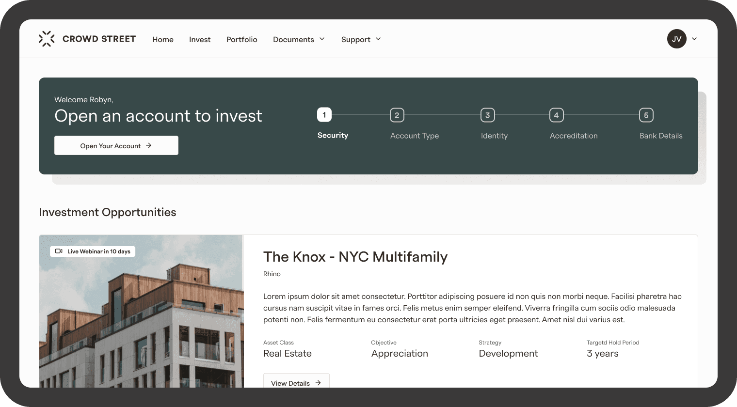
Logged in Homepage
4× increase in engagement within the Investment Opportunities section and a 63% increase in users entering the account opening flow.
Read Project

Portfolio
The views of the quarterly report increased by 30% and the CSAT score increased by 7%
Read Project

Account Creation
Design focused on increasing the amount of accounts
opened and submittedRead Project

Navigation
Navigation redesign of an investment platform
Read Project
Tax Center
Investor support tickets were reduced by 50% and
the CSAT score increased by 8%Read Project
Offer Dashboard
B2B dashboard that reduced the average time on task by 50%
Read Project
Logged in Homepage
4× increase in engagement within the Investment Opportunities section and a 63% increase in users entering the account opening flow.
Read Project
Portfolio
The views of the quarterly report increased by 30% and the CSAT score increased by 7%
Read Project
Account Creation
Design focused on increasing the amount of accounts
opened and submittedRead Project
Navigation
Navigation redesign of an investment platform
Read Project
Tax Center
Investor support tickets were reduced by 50% and
the CSAT score increased by 8%Read Project
Offer Dashboard
B2B dashboard that reduced the average time on task by 50%
Read Project
Logged in Homepage
4× increase in engagement within the Investment Opportunities section and a 63% increase in users entering the account opening flow.
Read Project
Portfolio
The views of the quarterly report increased by 30% and the CSAT score increased by 7%
Read Project
Account Creation
Design focused on increasing the amount of accounts
opened and submittedRead Project
Navigation
Navigation redesign of an investment platform
Read Project
Tax Center
Investor support tickets were reduced by 50% and
the CSAT score increased by 8%Read Project
Offer Dashboard
B2B dashboard that reduced the average time on task by 50%
Read Project
Logged in Homepage
4× increase in engagement within the Investment Opportunities section and a 63% increase in users entering the account opening flow.
Read Project
Portfolio
The views of the quarterly report increased by 30% and the CSAT score increased by 7%
Read Project
Account Creation
Design focused on increasing the amount of accounts
opened and submittedRead Project
Navigation
Navigation redesign of an investment platform
Read Project
Projects
Tax Center
Investor support tickets were reduced by 50% and
the CSAT score increased by 8%Read Project
Offer Dashboard
B2B dashboard that reduced the average time on task by 50%
Read Project
Logged in Homepage
4× increase in engagement within the Investment Opportunities section and a 63% increase in users entering the account opening flow.
Read Project
Portfolio
The views of the quarterly report increased by 30% and the CSAT score increased by 7%
Read Project
Account Creation
Design focused on increasing the amount of accounts
opened and submittedRead Project
Navigation
Navigation redesign of an investment platform
Read Project
Tax Center
Investor support tickets were reduced by 50% and
the CSAT score increased by 8%Read Project
Offer Dashboard
B2B dashboard that reduced the average time on task by 50%
Read Project
Logged in Homepage
4× increase in engagement within the Investment Opportunities section and a 63% increase in users entering the account opening flow.
Read Project
Portfolio
The views of the quarterly report increased by 30% and the CSAT score increased by 7%
Read Project
Account Creation
Design focused on increasing the amount of accounts
opened and submittedRead Project
Navigation
Navigation redesign of an investment platform
Read Project
Tax Center
Investor support tickets were reduced by 50% and
the CSAT score increased by 8%Read Project
Offer Dashboard
B2B dashboard that reduced the average time on task by 50%
Read Project
Logged in Homepage
4× increase in engagement within the Investment Opportunities section and a 63% increase in users entering the account opening flow.
Read Project
Portfolio
The views of the quarterly report increased by 30% and the CSAT score increased by 7%
Read Project
Account Creation
Design focused on increasing the amount of accounts
opened and submittedRead Project
Navigation
Navigation redesign of an investment platform
Read Project
Tax Center
Investor support tickets were reduced by 50% and
the CSAT score increased by 8%Read Project
Offer Dashboard
B2B dashboard that reduced the average time on task by 50%
Read Project
Logged in Homepage
4× increase in engagement within the Investment Opportunities section and a 63% increase in users entering the account opening flow.
Read Project
Portfolio
The views of the quarterly report increased by 30% and the CSAT score increased by 7%
Read Project
Account Creation
Design focused on increasing the amount of accounts
opened and submittedRead Project
Navigation
Navigation redesign of an investment platform
Read Project
Projects
Tax Center
Investor support tickets were reduced by 50% and
the CSAT score increased by 8%Read Project
Offer Dashboard
B2B dashboard that reduced the average time on task by 50%
Read Project
Logged in Homepage
4× increase in engagement within the Investment Opportunities section and a 63% increase in users entering the account opening flow.
Read Project
Portfolio
The views of the quarterly report increased by 30% and the CSAT score increased by 7%
Read Project
Account Creation
Design focused on increasing the amount of accounts
opened and submittedRead Project
Navigation
Navigation redesign of an investment platform
Read Project
Tax Center
Investor support tickets were reduced by 50% and
the CSAT score increased by 8%Read Project
Offer Dashboard
B2B dashboard that reduced the average time on task by 50%
Read Project
Logged in Homepage
4× increase in engagement within the Investment Opportunities section and a 63% increase in users entering the account opening flow.
Read Project
Portfolio
The views of the quarterly report increased by 30% and the CSAT score increased by 7%
Read Project
Account Creation
Design focused on increasing the amount of accounts
opened and submittedRead Project
Navigation
Navigation redesign of an investment platform
Read Project
Tax Center
Investor support tickets were reduced by 50% and
the CSAT score increased by 8%Read Project
Offer Dashboard
B2B dashboard that reduced the average time on task by 50%
Read Project
Logged in Homepage
4× increase in engagement within the Investment Opportunities section and a 63% increase in users entering the account opening flow.
Read Project
Portfolio
The views of the quarterly report increased by 30% and the CSAT score increased by 7%
Read Project
Account Creation
Design focused on increasing the amount of accounts
opened and submittedRead Project
Navigation
Navigation redesign of an investment platform
Read Project
Tax Center
Investor support tickets were reduced by 50% and
the CSAT score increased by 8%Read Project
Offer Dashboard
B2B dashboard that reduced the average time on task by 50%
Read Project
Logged in Homepage
4× increase in engagement within the Investment Opportunities section and a 63% increase in users entering the account opening flow.
Read Project
Portfolio
The views of the quarterly report increased by 30% and the CSAT score increased by 7%
Read Project
Account Creation
Design focused on increasing the amount of accounts
opened and submittedRead Project
Navigation
Navigation redesign of an investment platform
Read Project