Role: Designer & Researcher
Role: Designer & Researcher
Navigation
Navigation
Navigation redesign of an investment platform
Navigation redesign of an investment platform
Navigation redesign of an investment platform

objective
How might we modernize the navigation to help investors easily find the information they need?
How might we modernize the navigation to help investors easily find the information they need?
How might we modernize the navigation to help investors easily find the information they need?
Crowd Street is an alternative investment platform undergoing a rebrand. As part of this transformation, the company needed to update its navigation system to create a more intuitive user experience and enhance content discoverability.
Crowd Street is an alternative investment platform undergoing a rebrand. As part of this transformation, the company needed to update its navigation system to create a more intuitive user experience and enhance content discoverability.
Crowd Street is an alternative investment platform undergoing a rebrand. As part of this transformation, the company needed to update its navigation system to create a more intuitive user experience and enhance content discoverability.
RESEARCH
Audit & Initial Findings
Audit & Initial Findings
Audit & Initial Findings
I began by reviewing the existing navigation to identify basic usability issues and check any metrics available to determine next steps. Based on my evaluation and experience, I identified several key problems:
I began by reviewing the existing navigation to identify basic usability issues and check any metrics available to determine next steps. Based on my evaluation and experience, I identified several key problems:
I began by reviewing the existing navigation to identify basic usability issues and check any metrics available to determine next steps. Based on my evaluation and experience, I identified several key problems:


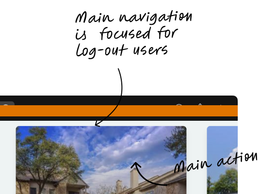
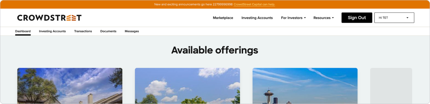
The site displayed two different navigation menus simultaneously: a top-level navigation geared toward logged-out users, and a secondary, bottom navigation for logged-in users. Having 11 link in the navigation made it difficult for users to know where to look and how to find specific pages.
The most prominent call to action in the navigation was "Sign Out"—a low-priority action that should not dominate the interface.
Google Analytics data showed that the top orange banner, presumably intended to draw attention, received a very low click-through rate—indicating it was largely ineffective. *
At the time of this project, I had been with CrowdStreet for three years and had developed a strong understanding of the investor journey and the limited set of key actions users need to complete. Given the platform’s simplicity, I decided to begin with an unmoderated test rather than a card sorting exercise. This allowed me to validate assumptions quickly and focus on optimizing the existing structure rather than generating new categories from scratch.
The site displayed two different navigation menus simultaneously: a top-level navigation geared toward logged-out users, and a secondary, bottom navigation for logged-in users. Having 11 link in the navigation made it difficult for users to know where to look and how to find specific pages.
The most prominent call to action in the navigation was "Sign Out"—a low-priority action that should not dominate the interface.
Google Analytics data showed that the top orange banner, presumably intended to draw attention, received a very low click-through rate—indicating it was largely ineffective. *
At the time of this project, I had been with CrowdStreet for three years and had developed a strong understanding of the investor journey and the limited set of key actions users need to complete. Given the platform’s simplicity, I decided to begin with an unmoderated test rather than a card sorting exercise. This allowed me to validate assumptions quickly and focus on optimizing the existing structure rather than generating new categories from scratch.
The site displayed two different navigation menus simultaneously: a top-level navigation geared toward logged-out users, and a secondary, bottom navigation for logged-in users. Having 11 link in the navigation made it difficult for users to know where to look and how to find specific pages.
The most prominent call to action in the navigation was "Sign Out"—a low-priority action that should not dominate the interface.
Google Analytics data showed that the top orange banner, presumably intended to draw attention, received a very low click-through rate—indicating it was largely ineffective. *
At the time of this project, I had been with CrowdStreet for three years and had developed a strong understanding of the investor journey and the limited set of key actions users need to complete. Given the platform’s simplicity, I decided to begin with an unmoderated test rather than a card sorting exercise. This allowed me to validate assumptions quickly and focus on optimizing the existing structure rather than generating new categories from scratch.
Cross-Functional Alignment
Cross-Functional Alignment
Cross-Functional Alignment
I facilitated a cross-functional meeting with representatives from Customer Care, Marketing, and the Project Manager to align on the actions included in the navigation and finalize the questions for the unmoderated usability test.
Using a Miro board, I mapped out all current navigation items. We reviewed together each item to determine which should be removed, renamed, or deprioritized. We also agreed to run an A/B test to determine whether or not to group "Notifications" and "Security" together.
I facilitated a cross-functional meeting with representatives from Customer Care, Marketing, and the Project Manager to align on the actions included in the navigation and finalize the questions for the unmoderated usability test.
Using a Miro board, I mapped out all current navigation items. We reviewed together each item to determine which should be removed, renamed, or deprioritized. We also agreed to run an A/B test to determine whether or not to group "Notifications" and "Security" together.
I facilitated a cross-functional meeting with representatives from Customer Care, Marketing, and the Project Manager to align on the actions included in the navigation and finalize the questions for the unmoderated usability test.
Using a Miro board, I mapped out all current navigation items. We reviewed together each item to determine which should be removed, renamed, or deprioritized. We also agreed to run an A/B test to determine whether or not to group "Notifications" and "Security" together.

Once the list was refined, we developed a corresponding question for each link to evaluate its findability in the unmoderated test.
Once the list was refined, we developed a corresponding question for each link to evaluate its findability in the unmoderated test.
Once the list was refined, we developed a corresponding question for each link to evaluate its findability in the unmoderated test.
design iterations & Testing
Design explorations
Design explorations
Design explorations
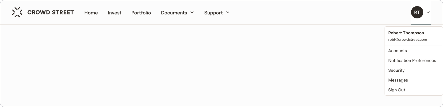
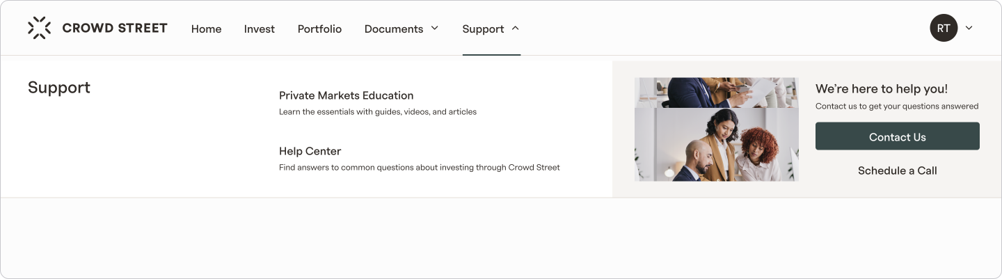
I explored two primary layout options for the site navigation: a top navigation bar and a sidebar menu. As part of this exploration, I also considered how each layout would interact with secondary navigation elements and how they would adapt across different device sizes and screen orientations.
I explored two primary layout options for the site navigation: a top navigation bar and a sidebar menu. As part of this exploration, I also considered how each layout would interact with secondary navigation elements and how they would adapt across different device sizes and screen orientations.
I explored two primary layout options for the site navigation: a top navigation bar and a sidebar menu. As part of this exploration, I also considered how each layout would interact with secondary navigation elements and how they would adapt across different device sizes and screen orientations.
TOP NAVIGATION OPTIONS
TOP NAVIGATION OPTIONS

SIDE NAVIGATION OPTION
SIDE NAVIGATION OPTION

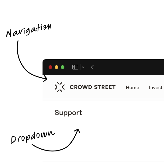
Ultimately, I recommended the top navigation layout for CrowdStreet. This approach offered more vertical space for content-heavy pages, improving readability — important for users reviewing detailed investment information.
Ultimately, I recommended the top navigation layout for CrowdStreet. This approach offered more vertical space for content-heavy pages, improving readability — important for users reviewing detailed investment information.
Ultimately, I recommended the top navigation layout for CrowdStreet. This approach offered more vertical space for content-heavy pages, improving readability — important for users reviewing detailed investment information.
Unmoderated testing
Unmoderated testing
Unmoderated testing
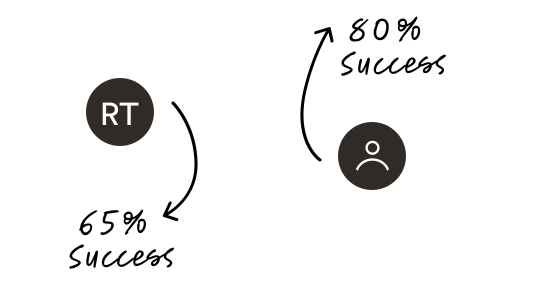
Our goal for the unmoderated tests was for at least 70% of participants to successfully find the correct link without making any errors. To achieve this, I conducted two rounds of testing—first with internal employees, then with external participants. In the initial round, 4 out of 10 tasks failed to meet the success threshold. After refining the navigation labels and test questions based on those results, the second round achieved our target success rate.
Our goal for the unmoderated tests was for at least 70% of participants to successfully find the correct link without making any errors. To achieve this, I conducted two rounds of testing—first with internal employees, then with external participants. In the initial round, 4 out of 10 tasks failed to meet the success threshold. After refining the navigation labels and test questions based on those results, the second round achieved our target success rate.
Our goal for the unmoderated tests was for at least 70% of participants to successfully find the correct link without making any errors. To achieve this, I conducted two rounds of testing—first with internal employees, then with external participants. In the initial round, 4 out of 10 tasks failed to meet the success threshold. After refining the navigation labels and test questions based on those results, the second round achieved our target success rate.
75%
75%
Direct Success Rate
(Without Extra Clicks)
Direct Success Rate
(Without Extra Clicks)
100%
100%
Success Rate
(With 2 Extra Clicks)
Success Rate
(With 2 Extra Clicks)
Lessons Learned
Lessons Learned
Lessons Learned
When the number of pages is limited, listing all of them in the navigation can significantly improve findability.
For unmoderated testing, replacing personalized content with more generic versions helps reduce confusion and ensures clearer results.
When the number of pages is limited, listing all of them in the navigation can significantly improve findability.
For unmoderated testing, replacing personalized content with more generic versions helps reduce confusion and ensures clearer results.
When the number of pages is limited, listing all of them in the navigation can significantly improve findability.
For unmoderated testing, replacing personalized content with more generic versions helps reduce confusion and ensures clearer results.

results
Project outcome
Project outcome
Project outcome
The new navigation was well received and CrowdStreet did not receive investor complaints about these changes.
The new navigation was well received and CrowdStreet did not receive investor complaints about these changes.
The new navigation was well received and CrowdStreet did not receive investor complaints about these changes.




Projects

Tax Center
Investor support tickets were reduced by 50% and
the CSAT score increased by 8%Read Project

Offer Dashboard
B2B dashboard that reduced the average time on task by 50%
Read Project
Logged in Homepage
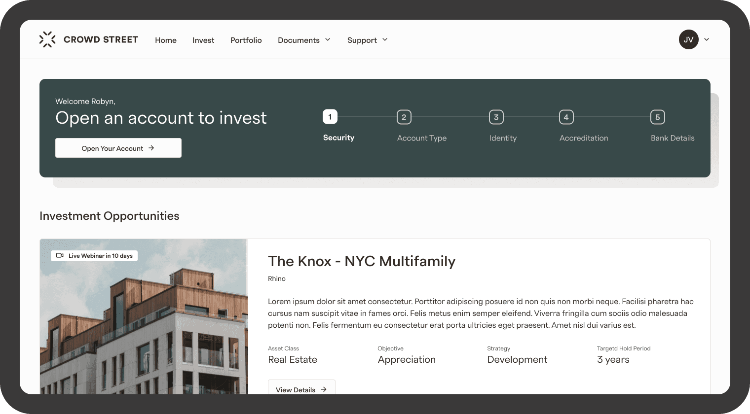
4× increase in engagement within the Investment Opportunities section and a 63% increase in users entering the account opening flow.
Read Project

Portfolio
The views of the quarterly report increased by 30% and the CSAT score increased by 7%
Read Project

Account Creation
Design focused on increasing the amount of accounts
opened and submittedRead Project

Navigation
Navigation redesign of an investment platform
Read Project
Tax Center
Investor support tickets were reduced by 50% and
the CSAT score increased by 8%Read Project
Offer Dashboard
B2B dashboard that reduced the average time on task by 50%
Read Project
Logged in Homepage
4× increase in engagement within the Investment Opportunities section and a 63% increase in users entering the account opening flow.
Read Project
Portfolio
The views of the quarterly report increased by 30% and the CSAT score increased by 7%
Read Project
Account Creation
Design focused on increasing the amount of accounts
opened and submittedRead Project
Navigation
Navigation redesign of an investment platform
Read Project
Tax Center
Investor support tickets were reduced by 50% and
the CSAT score increased by 8%Read Project
Offer Dashboard
B2B dashboard that reduced the average time on task by 50%
Read Project
Logged in Homepage
4× increase in engagement within the Investment Opportunities section and a 63% increase in users entering the account opening flow.
Read Project
Portfolio
The views of the quarterly report increased by 30% and the CSAT score increased by 7%
Read Project
Account Creation
Design focused on increasing the amount of accounts
opened and submittedRead Project
Navigation
Navigation redesign of an investment platform
Read Project
Tax Center
Investor support tickets were reduced by 50% and
the CSAT score increased by 8%Read Project
Offer Dashboard
B2B dashboard that reduced the average time on task by 50%
Read Project
Logged in Homepage
4× increase in engagement within the Investment Opportunities section and a 63% increase in users entering the account opening flow.
Read Project
Portfolio
The views of the quarterly report increased by 30% and the CSAT score increased by 7%
Read Project
Account Creation
Design focused on increasing the amount of accounts
opened and submittedRead Project
Navigation
Navigation redesign of an investment platform
Read Project
Projects
Tax Center
Investor support tickets were reduced by 50% and
the CSAT score increased by 8%Read Project
Offer Dashboard
B2B dashboard that reduced the average time on task by 50%
Read Project
Logged in Homepage
4× increase in engagement within the Investment Opportunities section and a 63% increase in users entering the account opening flow.
Read Project
Portfolio
The views of the quarterly report increased by 30% and the CSAT score increased by 7%
Read Project
Account Creation
Design focused on increasing the amount of accounts
opened and submittedRead Project
Navigation
Navigation redesign of an investment platform
Read Project
Tax Center
Investor support tickets were reduced by 50% and
the CSAT score increased by 8%Read Project
Offer Dashboard
B2B dashboard that reduced the average time on task by 50%
Read Project
Logged in Homepage
4× increase in engagement within the Investment Opportunities section and a 63% increase in users entering the account opening flow.
Read Project
Portfolio
The views of the quarterly report increased by 30% and the CSAT score increased by 7%
Read Project
Account Creation
Design focused on increasing the amount of accounts
opened and submittedRead Project
Navigation
Navigation redesign of an investment platform
Read Project
Tax Center
Investor support tickets were reduced by 50% and
the CSAT score increased by 8%Read Project
Offer Dashboard
B2B dashboard that reduced the average time on task by 50%
Read Project
Logged in Homepage
4× increase in engagement within the Investment Opportunities section and a 63% increase in users entering the account opening flow.
Read Project
Portfolio
The views of the quarterly report increased by 30% and the CSAT score increased by 7%
Read Project
Account Creation
Design focused on increasing the amount of accounts
opened and submittedRead Project
Navigation
Navigation redesign of an investment platform
Read Project
Tax Center
Investor support tickets were reduced by 50% and
the CSAT score increased by 8%Read Project
Offer Dashboard
B2B dashboard that reduced the average time on task by 50%
Read Project
Logged in Homepage
4× increase in engagement within the Investment Opportunities section and a 63% increase in users entering the account opening flow.
Read Project
Portfolio
The views of the quarterly report increased by 30% and the CSAT score increased by 7%
Read Project
Account Creation
Design focused on increasing the amount of accounts
opened and submittedRead Project
Navigation
Navigation redesign of an investment platform
Read Project
Projects
Tax Center
Investor support tickets were reduced by 50% and
the CSAT score increased by 8%Read Project
Offer Dashboard
B2B dashboard that reduced the average time on task by 50%
Read Project
Logged in Homepage
4× increase in engagement within the Investment Opportunities section and a 63% increase in users entering the account opening flow.
Read Project
Portfolio
The views of the quarterly report increased by 30% and the CSAT score increased by 7%
Read Project
Account Creation
Design focused on increasing the amount of accounts
opened and submittedRead Project
Navigation
Navigation redesign of an investment platform
Read Project
Tax Center
Investor support tickets were reduced by 50% and
the CSAT score increased by 8%Read Project
Offer Dashboard
B2B dashboard that reduced the average time on task by 50%
Read Project
Logged in Homepage
4× increase in engagement within the Investment Opportunities section and a 63% increase in users entering the account opening flow.
Read Project
Portfolio
The views of the quarterly report increased by 30% and the CSAT score increased by 7%
Read Project
Account Creation
Design focused on increasing the amount of accounts
opened and submittedRead Project
Navigation
Navigation redesign of an investment platform
Read Project
Tax Center
Investor support tickets were reduced by 50% and
the CSAT score increased by 8%Read Project
Offer Dashboard
B2B dashboard that reduced the average time on task by 50%
Read Project
Logged in Homepage
4× increase in engagement within the Investment Opportunities section and a 63% increase in users entering the account opening flow.
Read Project
Portfolio
The views of the quarterly report increased by 30% and the CSAT score increased by 7%
Read Project
Account Creation
Design focused on increasing the amount of accounts
opened and submittedRead Project
Navigation
Navigation redesign of an investment platform
Read Project
Tax Center
Investor support tickets were reduced by 50% and
the CSAT score increased by 8%Read Project
Offer Dashboard
B2B dashboard that reduced the average time on task by 50%
Read Project
Logged in Homepage
4× increase in engagement within the Investment Opportunities section and a 63% increase in users entering the account opening flow.
Read Project
Portfolio
The views of the quarterly report increased by 30% and the CSAT score increased by 7%
Read Project
Account Creation
Design focused on increasing the amount of accounts
opened and submittedRead Project
Navigation
Navigation redesign of an investment platform
Read Project