Account Creation
Account Creation
Role: UX/UI Designer & Researcher
Techniques: Unmoderated Testing
Role: UX/UI Designer & Researcher
Techniques: Unmoderated Testing
Role: UX/UI Designer & Researcher
Techniques: Unmoderated Testing

objective
How might we increase the amount of submitted accounts?
How might we increase the amount of submitted accounts?
How might we increase the amount of submitted accounts?
CrowdStreet is an alternative investment platform that requires all members to have an approved investment account in order to invest. Hence, this project goal is to increase the number of submitted accounts.
CrowdStreet is an alternative investment platform that requires all members to have an approved investment account in order to invest. Hence, this project goal is to increase the number of submitted accounts.
CrowdStreet is an alternative investment platform that requires all members to have an approved investment account in order to invest. Hence, this project goal is to increase the number of submitted accounts.
RESEARCH
Audit & Initial Findings
Audit & Initial Findings
Audit & Initial Findings
I began by reviewing the existing user flow to identify basic usability issues and check any metrics available to determine next steps. Based on my evaluation and experience, I identified several key problems:
I began by reviewing the existing user flow to identify basic usability issues and check any metrics available to determine next steps. Based on my evaluation and experience, I identified several key problems:
I began by reviewing the existing user flow to identify basic usability issues and check any metrics available to determine next steps. Based on my evaluation and experience, I identified several key problems:


A red banner appear on each step, giving users the impression that they've made a mistake—even before they’ve taken any action.
All required fields are labeled with red "required" indicators, reinforcing a sense of error prematurely.
An excessive number of buttons on each screen makes the experience feel cluttered and difficult to navigate.
In one step, users must click "Edit" to enter their personal information, but the page layout unintentionally guides them toward a different button, leading them into the wrong flow.
One step in the process is particularly overwhelming: investors are required to download an Excel template, fill it out, and upload it alongside additional documents.
After completing the flow, users see a yellow banner indicating their account is under review. However, this banner lacks a clear sense of completion or user gratification.
The flow includes 58 questions, many of which are lengthy and rely heavily on tooltips for clarification.
A small percentage of users selected the incorrect accreditation method.
Following this evaluation, I met with stakeholders and the project manager to collaboratively explore ways to reduce the number of questions and improve the clarity of the content and instructions throughout the experience.
A red banner appear on each step, giving users the impression that they've made a mistake—even before they’ve taken any action.
All required fields are labeled with red "required" indicators, reinforcing a sense of error prematurely.
An excessive number of buttons on each screen makes the experience feel cluttered and difficult to navigate.
In one step, users must click "Edit" to enter their personal information, but the page layout unintentionally guides them toward a different button, leading them into the wrong flow.
One step in the process is particularly overwhelming: investors are required to download an Excel template, fill it out, and upload it alongside additional documents.
After completing the flow, users see a yellow banner indicating their account is under review. However, this banner lacks a clear sense of completion or user gratification.
The flow includes 58 questions, many of which are lengthy and rely heavily on tooltips for clarification.
A small percentage of users selected the incorrect accreditation method.
Following this evaluation, I met with stakeholders and the project manager to collaboratively explore ways to reduce the number of questions and improve the clarity of the content and instructions throughout the experience.
A red banner appear on each step, giving users the impression that they've made a mistake—even before they’ve taken any action.
All required fields are labeled with red "required" indicators, reinforcing a sense of error prematurely.
An excessive number of buttons on each screen makes the experience feel cluttered and difficult to navigate.
In one step, users must click "Edit" to enter their personal information, but the page layout unintentionally guides them toward a different button, leading them into the wrong flow.
One step in the process is particularly overwhelming: investors are required to download an Excel template, fill it out, and upload it alongside additional documents.
After completing the flow, users see a yellow banner indicating their account is under review. However, this banner lacks a clear sense of completion or user gratification.
The flow includes 58 questions, many of which are lengthy and rely heavily on tooltips for clarification.
A small percentage of users selected the incorrect accreditation method.
Following this evaluation, I met with stakeholders and the project manager to collaboratively explore ways to reduce the number of questions and improve the clarity of the content and instructions throughout the experience.
Cross-Functional Alignment
Cross-Functional Alignment
Cross-Functional Alignment
The project manager and I shared a document with stakeholders and the compliance team that listed all the questions currently required to complete the account creation. Our goal was to reduce the total number of questions, so we asked them to highlight only the absolutely necessary ones. However, instead of reducing the list, they added 20 more questions to improve their marketing targeting.
At that point, it became clear that we weren’t aligned on priorities. To help guide the conversation with data, I ran an unmoderated usability test to compare three flows: one with 78 questions, another with 58, and a simplified version with just 22. The 22-question version outperformed the others, showing a 22% higher conversation rate than the 58-question flow and a 50% higher rate than the 78-question version.
In parallel, we were also running a live A/B/C registration test on production:
Flow A: 3 questions
Flow B: 6 questions
Flow C: 9 questions
Again, the trend was consistent: the shortest flow (Flow A) had the highest conversion rate.
After reviewing these results with stakeholders, we were able to align on a new approach and agreed to:
Limit the required questions to 32
Show 9 optional questions inside an expandable accordion. By law, the business needs to make a reasonable effort to ask these 9 questions that are not required for the business itself. As a result, we placed them in an accordion to reduce visual and cognitive load.
The entire team collaborated to ensure each question was concise, easy to understand, and compliant.
The project manager and I shared a document with stakeholders and the compliance team that listed all the questions currently required to complete the account creation. Our goal was to reduce the total number of questions, so we asked them to highlight only the absolutely necessary ones. However, instead of reducing the list, they added 20 more questions to improve their marketing targeting.
At that point, it became clear that we weren’t aligned on priorities. To help guide the conversation with data, I ran an unmoderated usability test to compare three flows: one with 78 questions, another with 58, and a simplified version with just 22. The 22-question version outperformed the others, showing a 22% higher conversation rate than the 58-question flow and a 50% higher rate than the 78-question version.
In parallel, we were also running a live A/B/C registration test on production:
Flow A: 3 questions
Flow B: 6 questions
Flow C: 9 questions
Again, the trend was consistent: the shortest flow (Flow A) had the highest conversion rate.
After reviewing these results with stakeholders, we were able to align on a new approach and agreed to:
Limit the required questions to 32
Show 9 optional questions inside an expandable accordion. By law, the business needs to make a reasonable effort to ask these 9 questions that are not required for the business itself. As a result, we placed them in an accordion to reduce visual and cognitive load.
The entire team collaborated to ensure each question was concise, easy to understand, and compliant.
The project manager and I shared a document with stakeholders and the compliance team that listed all the questions currently required to complete the account creation. Our goal was to reduce the total number of questions, so we asked them to highlight only the absolutely necessary ones. However, instead of reducing the list, they added 20 more questions to improve their marketing targeting.
At that point, it became clear that we weren’t aligned on priorities. To help guide the conversation with data, I ran an unmoderated usability test to compare three flows: one with 78 questions, another with 58, and a simplified version with just 22. The 22-question version outperformed the others, showing a 22% higher conversation rate than the 58-question flow and a 50% higher rate than the 78-question version.
In parallel, we were also running a live A/B/C registration test on production:
Flow A: 3 questions
Flow B: 6 questions
Flow C: 9 questions
Again, the trend was consistent: the shortest flow (Flow A) had the highest conversion rate.
After reviewing these results with stakeholders, we were able to align on a new approach and agreed to:
Limit the required questions to 32
Show 9 optional questions inside an expandable accordion. By law, the business needs to make a reasonable effort to ask these 9 questions that are not required for the business itself. As a result, we placed them in an accordion to reduce visual and cognitive load.
The entire team collaborated to ensure each question was concise, easy to understand, and compliant.
design iterations & Testing
Design explorations
Design explorations
Design explorations
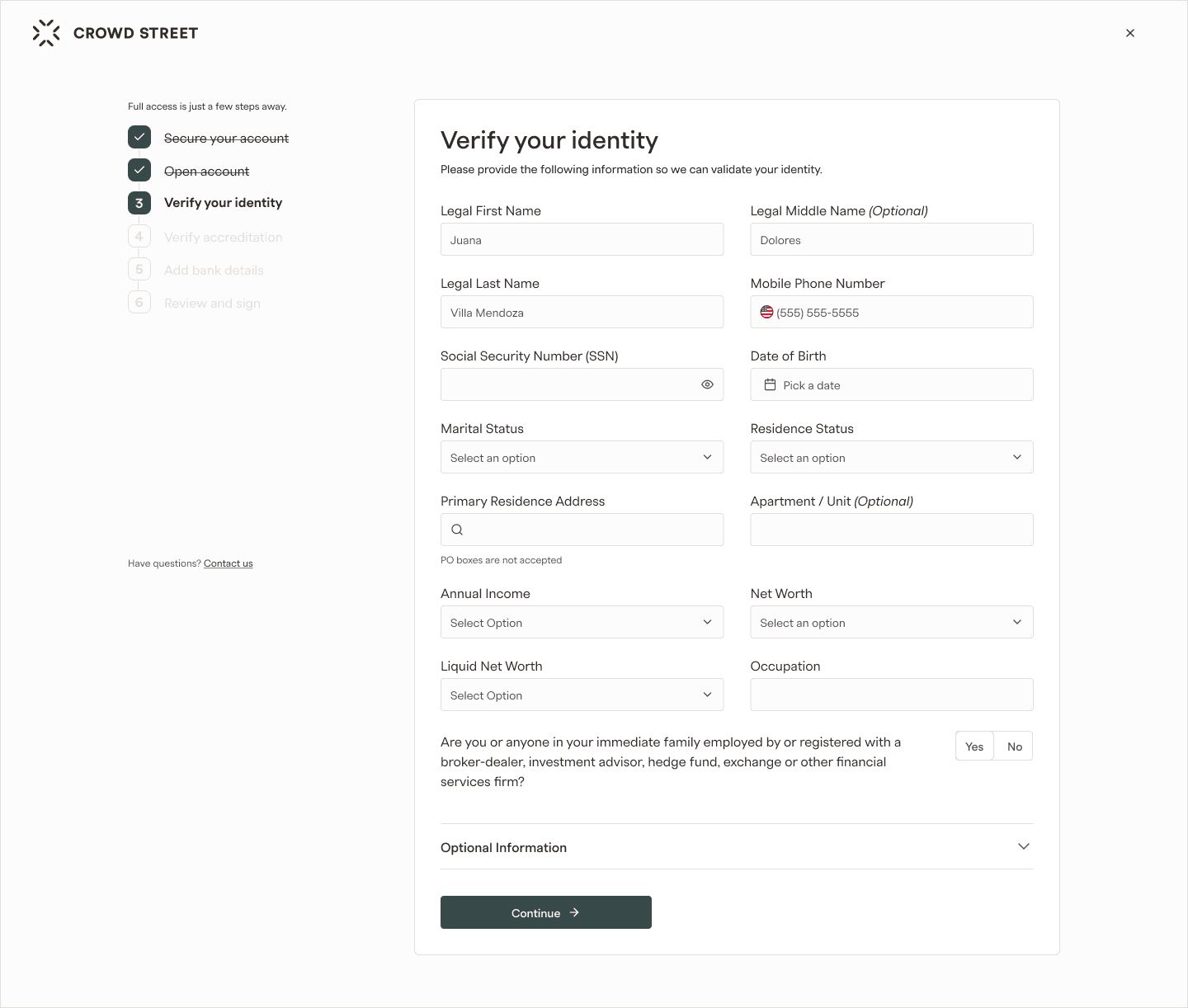
The goal of this design layout is to reduce noise by showing only the necessary information and links. We accomplish this by minimizing the global top nav, having only one button in the page, and by having in view most or all questions for that step.
The goal of this design layout is to reduce noise by showing only the necessary information and links. We accomplish this by minimizing the global top nav, having only one button in the page, and by having in view most or all questions for that step.
The goal of this design layout is to reduce noise by showing only the necessary information and links. We accomplish this by minimizing the global top nav, having only one button in the page, and by having in view most or all questions for that step.

Most of the design explorations were focused on how to display each type of question to reduce its visual height in the page:
Most of the design explorations were focused on how to display each type of question to reduce its visual height in the page:
Most of the design explorations were focused on how to display each type of question to reduce its visual height in the page:

results
Project outcome
Project outcome
Project outcome
Statistical outcomes are coming soon. Meanwhile, you can review the end design.
Statistical outcomes are coming soon. Meanwhile, you can review the end design.
Statistical outcomes are coming soon. Meanwhile, you can review the end design.



Projects

Tax Center
Investor support tickets were reduced by 50% and
the CSAT score increased by 8%Read Project

Offer Dashboard
B2B dashboard that reduced the average time on task by 50%
Read Project
Logged in Homepage
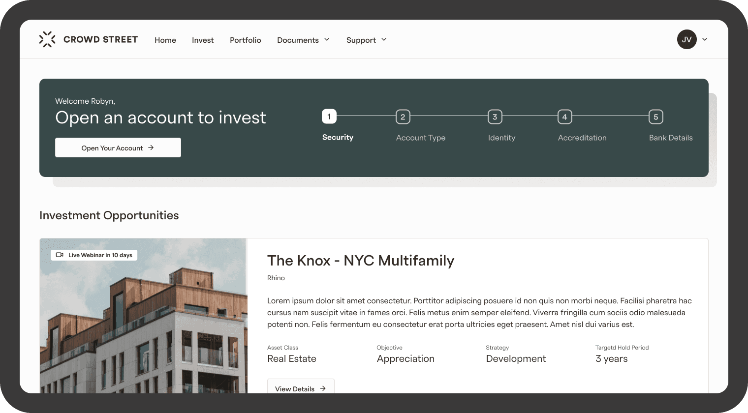
4× increase in engagement within the Investment Opportunities section and a 63% increase in users entering the account opening flow.
Read Project

Portfolio
The views of the quarterly report increased by 30% and the CSAT score increased by 7%
Read Project

Account Creation
Design focused on increasing the amount of accounts
opened and submittedRead Project

Navigation
Navigation redesign of an investment platform
Read Project
Tax Center
Investor support tickets were reduced by 50% and
the CSAT score increased by 8%Read Project
Offer Dashboard
B2B dashboard that reduced the average time on task by 50%
Read Project
Logged in Homepage
4× increase in engagement within the Investment Opportunities section and a 63% increase in users entering the account opening flow.
Read Project
Portfolio
The views of the quarterly report increased by 30% and the CSAT score increased by 7%
Read Project
Account Creation
Design focused on increasing the amount of accounts
opened and submittedRead Project
Navigation
Navigation redesign of an investment platform
Read Project
Tax Center
Investor support tickets were reduced by 50% and
the CSAT score increased by 8%Read Project
Offer Dashboard
B2B dashboard that reduced the average time on task by 50%
Read Project
Logged in Homepage
4× increase in engagement within the Investment Opportunities section and a 63% increase in users entering the account opening flow.
Read Project
Portfolio
The views of the quarterly report increased by 30% and the CSAT score increased by 7%
Read Project
Account Creation
Design focused on increasing the amount of accounts
opened and submittedRead Project
Navigation
Navigation redesign of an investment platform
Read Project
Tax Center
Investor support tickets were reduced by 50% and
the CSAT score increased by 8%Read Project
Offer Dashboard
B2B dashboard that reduced the average time on task by 50%
Read Project
Logged in Homepage
4× increase in engagement within the Investment Opportunities section and a 63% increase in users entering the account opening flow.
Read Project
Portfolio
The views of the quarterly report increased by 30% and the CSAT score increased by 7%
Read Project
Account Creation
Design focused on increasing the amount of accounts
opened and submittedRead Project
Navigation
Navigation redesign of an investment platform
Read Project
Projects
Tax Center
Investor support tickets were reduced by 50% and
the CSAT score increased by 8%Read Project
Offer Dashboard
B2B dashboard that reduced the average time on task by 50%
Read Project
Logged in Homepage
4× increase in engagement within the Investment Opportunities section and a 63% increase in users entering the account opening flow.
Read Project
Portfolio
The views of the quarterly report increased by 30% and the CSAT score increased by 7%
Read Project
Account Creation
Design focused on increasing the amount of accounts
opened and submittedRead Project
Navigation
Navigation redesign of an investment platform
Read Project
Tax Center
Investor support tickets were reduced by 50% and
the CSAT score increased by 8%Read Project
Offer Dashboard
B2B dashboard that reduced the average time on task by 50%
Read Project
Logged in Homepage
4× increase in engagement within the Investment Opportunities section and a 63% increase in users entering the account opening flow.
Read Project
Portfolio
The views of the quarterly report increased by 30% and the CSAT score increased by 7%
Read Project
Account Creation
Design focused on increasing the amount of accounts
opened and submittedRead Project
Navigation
Navigation redesign of an investment platform
Read Project
Tax Center
Investor support tickets were reduced by 50% and
the CSAT score increased by 8%Read Project
Offer Dashboard
B2B dashboard that reduced the average time on task by 50%
Read Project
Logged in Homepage
4× increase in engagement within the Investment Opportunities section and a 63% increase in users entering the account opening flow.
Read Project
Portfolio
The views of the quarterly report increased by 30% and the CSAT score increased by 7%
Read Project
Account Creation
Design focused on increasing the amount of accounts
opened and submittedRead Project
Navigation
Navigation redesign of an investment platform
Read Project
Tax Center
Investor support tickets were reduced by 50% and
the CSAT score increased by 8%Read Project
Offer Dashboard
B2B dashboard that reduced the average time on task by 50%
Read Project
Logged in Homepage
4× increase in engagement within the Investment Opportunities section and a 63% increase in users entering the account opening flow.
Read Project
Portfolio
The views of the quarterly report increased by 30% and the CSAT score increased by 7%
Read Project
Account Creation
Design focused on increasing the amount of accounts
opened and submittedRead Project
Navigation
Navigation redesign of an investment platform
Read Project
Projects
Tax Center
Investor support tickets were reduced by 50% and
the CSAT score increased by 8%Read Project
Offer Dashboard
B2B dashboard that reduced the average time on task by 50%
Read Project
Logged in Homepage
4× increase in engagement within the Investment Opportunities section and a 63% increase in users entering the account opening flow.
Read Project
Portfolio
The views of the quarterly report increased by 30% and the CSAT score increased by 7%
Read Project
Account Creation
Design focused on increasing the amount of accounts
opened and submittedRead Project
Navigation
Navigation redesign of an investment platform
Read Project
Tax Center
Investor support tickets were reduced by 50% and
the CSAT score increased by 8%Read Project
Offer Dashboard
B2B dashboard that reduced the average time on task by 50%
Read Project
Logged in Homepage
4× increase in engagement within the Investment Opportunities section and a 63% increase in users entering the account opening flow.
Read Project
Portfolio
The views of the quarterly report increased by 30% and the CSAT score increased by 7%
Read Project
Account Creation
Design focused on increasing the amount of accounts
opened and submittedRead Project
Navigation
Navigation redesign of an investment platform
Read Project
Tax Center
Investor support tickets were reduced by 50% and
the CSAT score increased by 8%Read Project
Offer Dashboard
B2B dashboard that reduced the average time on task by 50%
Read Project
Logged in Homepage
4× increase in engagement within the Investment Opportunities section and a 63% increase in users entering the account opening flow.
Read Project
Portfolio
The views of the quarterly report increased by 30% and the CSAT score increased by 7%
Read Project
Account Creation
Design focused on increasing the amount of accounts
opened and submittedRead Project
Navigation
Navigation redesign of an investment platform
Read Project
Tax Center
Investor support tickets were reduced by 50% and
the CSAT score increased by 8%Read Project
Offer Dashboard
B2B dashboard that reduced the average time on task by 50%
Read Project
Logged in Homepage
4× increase in engagement within the Investment Opportunities section and a 63% increase in users entering the account opening flow.
Read Project
Portfolio
The views of the quarterly report increased by 30% and the CSAT score increased by 7%
Read Project
Account Creation
Design focused on increasing the amount of accounts
opened and submittedRead Project
Navigation
Navigation redesign of an investment platform
Read Project