Logged in Homepage
Logged in Homepage
Role: UX/UI Designer & Researcher
Techniques: User Journey Map, 5 Second Test, Unmoderated Testing
Role: UX/UI Designer & Researcher
Techniques: User Journey Map, 5 Second Test, Unmoderated Testing
Role: UX/UI Designer & Researcher
Techniques: User Journey Map, 5 Second Test, Unmoderated Testing

EXECUTIVE SUMMARY
The previous homepage lacked personalization and clarity, making it difficult for investors to understand which actions were required of them or what products CrowdStreet offered. To address this, I collaborated with the Project Manager, Investor Care, Engineering, and Marketing teams to create a User Journey Map, identifying three key stages of the investor journey and their corresponding needs.
I then tested two layout concepts through a five-second unmoderated test, which revealed that a single-column layout improved scanability and recall of pending actions and available products.
The final redesign delivered measurable impact—4× more clicks in the Investment Opportunities section and increased by 63% the amount of users that entering the account opening flow.
The previous homepage lacked personalization and clarity, making it difficult for investors to understand which actions were required of them or what products CrowdStreet offered. To address this, I collaborated with the Project Manager, Investor Care, Engineering, and Marketing teams to create a User Journey Map, identifying three key stages of the investor journey and their corresponding needs.
I then tested two layout concepts through a five-second unmoderated test, which revealed that a single-column layout improved scanability and recall of pending actions and available products.
The final redesign delivered measurable impact—4× more clicks in the Investment Opportunities section and increased by 63% the amount of users that entering the account opening flow.
The previous homepage lacked personalization and clarity, making it difficult for investors to understand which actions were required of them or what products CrowdStreet offered. To address this, I collaborated with the Project Manager, Investor Care, Engineering, and Marketing teams to create a User Journey Map, identifying three key stages of the investor journey and their corresponding needs.
I then tested two layout concepts through a five-second unmoderated test, which revealed that a single-column layout improved scanability and recall of pending actions and available products.
The final redesign delivered measurable impact—4× more clicks in the Investment Opportunities section and increased by 63% the amount of users that entering the account opening flow.
Problem statement
The homepage was failing to engage users, preventing them from discovering investment opportunities, exploring products, or taking key actions like opening an account.
The homepage was failing to engage users, preventing them from discovering investment opportunities, exploring products, or taking key actions like opening an account.
The homepage was failing to engage users, preventing them from discovering investment opportunities, exploring products, or taking key actions like opening an account.
RESEARCH
Audit & Initial Findings
Audit & Initial Findings
Audit & Initial Findings
I began by reviewing the existing homepage to identify basic usability issues and check any metrics available to determine next steps. Based on my evaluation and experience, I identified several key problems:
I began by reviewing the existing homepage to identify basic usability issues and check any metrics available to determine next steps. Based on my evaluation and experience, I identified several key problems:
I began by reviewing the existing homepage to identify basic usability issues and check any metrics available to determine next steps. Based on my evaluation and experience, I identified several key problems:

The page currently lacks a clear purpose.
The list of actions users need to take is presented as a bulleted list that appears disabled, even though each item is clickable—creating confusion and reducing engagement.
The primary call to action is misleading. Instead of prompting users to open an investment account or complete their profile, it directs them to "Watch a Video," which is not the most relevant next step.
The section showcasing investment options—CrowdStreet’s core product—is not presented in a way that generates awareness or interest.
Additionally, the "Real Estate Education" section is the most visually prominent, despite being one of the least critical areas for new or returning users.
There’s also no personalized journey to guide users through what they need to do and when. Instead, users are expected to already know the steps, which creates frustration and uncertainty.
Users are presented with 13 links, yet there is only a single primary action, which hinder task completion, engagement, and conversion.
The two main issues I identified were the lack of a clear purpose and the absence of meaningful guidance for investors. As a result, I decided to begin with a User Journey Map to explore how the dashboard can better support each stage of the investor's journey.
The page currently lacks a clear purpose.
The list of actions users need to take is presented as a bulleted list that appears disabled, even though each item is clickable—creating confusion and reducing engagement.
The primary call to action is misleading. Instead of prompting users to open an investment account or complete their profile, it directs them to "Watch a Video," which is not the most relevant next step.
The section showcasing investment options—CrowdStreet’s core product—is not presented in a way that generates awareness or interest.
Additionally, the "Real Estate Education" section is the most visually prominent, despite being one of the least critical areas for new or returning users.
There’s also no personalized journey to guide users through what they need to do and when. Instead, users are expected to already know the steps, which creates frustration and uncertainty.
Users are presented with 13 links, yet there is only a single primary action, which hinder task completion, engagement, and conversion.
The two main issues I identified were the lack of a clear purpose and the absence of meaningful guidance for investors. As a result, I decided to begin with a User Journey Map to explore how the dashboard can better support each stage of the investor's journey.
The page currently lacks a clear purpose.
The list of actions users need to take is presented as a bulleted list that appears disabled, even though each item is clickable—creating confusion and reducing engagement.
The primary call to action is misleading. Instead of prompting users to open an investment account or complete their profile, it directs them to "Watch a Video," which is not the most relevant next step.
The section showcasing investment options—CrowdStreet’s core product—is not presented in a way that generates awareness or interest.
Additionally, the "Real Estate Education" section is the most visually prominent, despite being one of the least critical areas for new or returning users.
There’s also no personalized journey to guide users through what they need to do and when. Instead, users are expected to already know the steps, which creates frustration and uncertainty.
Users are presented with 13 links, yet there is only a single primary action, which hinder task completion, engagement, and conversion.
The two main issues I identified were the lack of a clear purpose and the absence of meaningful guidance for investors. As a result, I decided to begin with a User Journey Map to explore how the dashboard can better support each stage of the investor's journey.
Cross-Functional Alignment
Cross-Functional Alignment
Cross-Functional Alignment
I facilitated a User Journey Mapping workshop with representatives from Customer Care, Marketing, Engineering, and the Project Manager to align on user needs and project goals. We began by defining the dashboard’s primary purpose:
I facilitated a User Journey Mapping workshop with representatives from Customer Care, Marketing, Engineering, and the Project Manager to align on user needs and project goals. We began by defining the dashboard’s primary purpose:
I facilitated a User Journey Mapping workshop with representatives from Customer Care, Marketing, Engineering, and the Project Manager to align on user needs and project goals. We began by defining the dashboard’s primary purpose:
“The goal of the dashboard is to raise awareness of available products and to encourage the initiation of pending tasks.”
“The goal of the dashboard is to raise awareness of available products and to encourage the initiation of pending tasks.”
“The goal of the dashboard is to raise awareness of available products and to encourage the initiation of pending tasks.”
Then, we mapped the ideal investor journey. For each stage, we identified: the key actions investors need to take and the type of content that is relevant.
Then, we mapped the ideal investor journey. For each stage, we identified: the key actions investors need to take and the type of content that is relevant.
Then, we mapped the ideal investor journey. For each stage, we identified: the key actions investors need to take and the type of content that is relevant.

design iterations & Testing
Design explorations
Design explorations
Design explorations
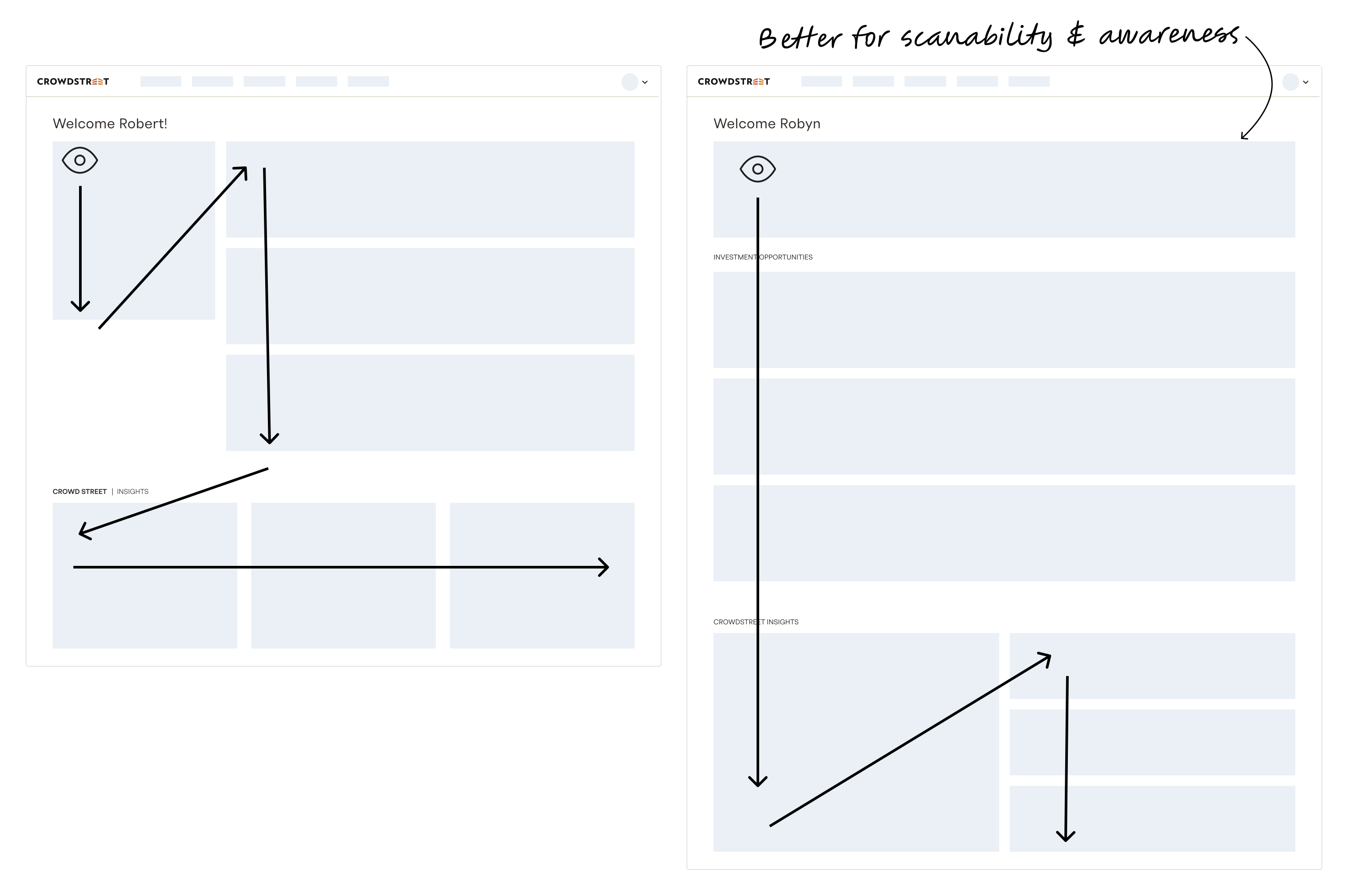
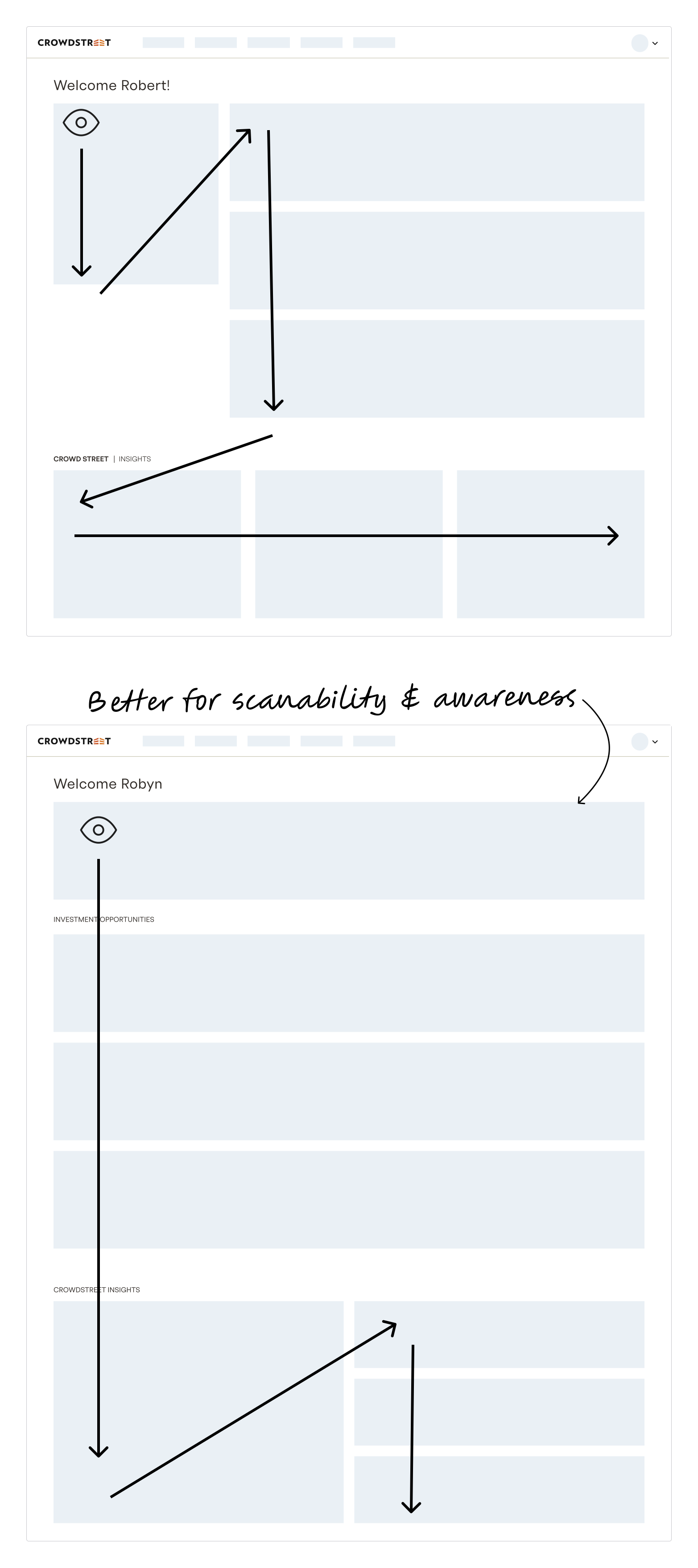
I explored two primary layout options—a single-column and a two-column design—and conducted a five-second unmoderated test to evaluate which layout improved content scanability and memorability for users.
I explored two primary layout options—a single-column and a two-column design—and conducted a five-second unmoderated test to evaluate which layout improved content scanability and memorability for users.
I explored two primary layout options—a single-column and a two-column design—and conducted a five-second unmoderated test to evaluate which layout improved content scanability and memorability for users.
TWO COLUMN LAYOUT

ONE COLUMN LAYOUT

Unmoderated testing
Unmoderated testing
Unmoderated testing
I conducted a five-second unmoderated test to evaluate which layout provided higher awareness of the key content areas: onboarding steps (actions to take), available products, and educational content. Participants were asked two randomized questions:
Which design format did you prefer?
What do you recall from the image you just saw?
The results showed that the one-column layout had a 20% higher preference and a 15% higher overall recall compared to the two-column layout. Notably, educational content was the least recalled in both layouts, reflecting its lower priority in the overall design.
I conducted a five-second unmoderated test to evaluate which layout provided higher awareness of the key content areas: onboarding steps (actions to take), available products, and educational content. Participants were asked two randomized questions:
Which design format did you prefer?
What do you recall from the image you just saw?
The results showed that the one-column layout had a 20% higher preference and a 15% higher overall recall compared to the two-column layout. Notably, educational content was the least recalled in both layouts, reflecting its lower priority in the overall design.
I conducted a five-second unmoderated test to evaluate which layout provided higher awareness of the key content areas: onboarding steps (actions to take), available products, and educational content. Participants were asked two randomized questions:
Which design format did you prefer?
What do you recall from the image you just saw?
The results showed that the one-column layout had a 20% higher preference and a 15% higher overall recall compared to the two-column layout. Notably, educational content was the least recalled in both layouts, reflecting its lower priority in the overall design.
20%
20%
Higher preference on one-column layout
15%
15%
15%
Higher overall recall on one-column layout
Based on these results, I selected the one-column layout for its improved scanability and higher recall of pending actions and available products.
Based on these results, I selected the one-column layout for its improved scanability and higher recall of pending actions and available products.
Based on these results, I selected the one-column layout for its improved scanability and higher recall of pending actions and available products.
TWO COLUMN LAYOUT

ONE COLUMN LAYOUT

Lessons Learned
Lessons Learned
Lessons Learned
Layouts that guide the eye naturally and require less visual effort are easier to scan and make their content more memorable (F-Pattern).
Layouts that guide the eye naturally and require less visual effort are easier to scan and make their content more memorable (F-Pattern).
Layouts that guide the eye naturally and require less visual effort are easier to scan and make their content more memorable (F-Pattern).
results
Project outcome
Project outcome
Project outcome
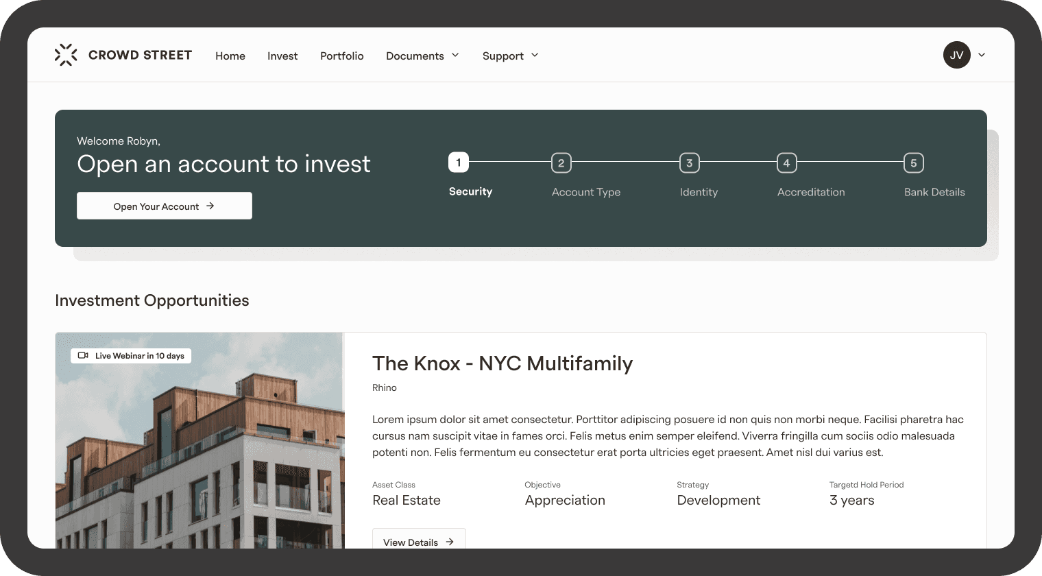
The project’s success was measured by user engagement with the two most critical areas of the homepage: the actions banner and the investment opportunities section.
The redesigned homepage significantly improved user interactions, driving 4× more engagement in the Investment Opportunities section and it drove 63% more users to the account creation flow, demonstrating the impact of a more intuitive and user-centered layout.
The project’s success was measured by user engagement with the two most critical areas of the homepage: the actions banner and the investment opportunities section.
The redesigned homepage significantly improved user interactions, driving 4× more engagement in the Investment Opportunities section and it drove 63% more users to the account creation flow, demonstrating the impact of a more intuitive and user-centered layout.
The project’s success was measured by user engagement with the two most critical areas of the homepage: the actions banner and the investment opportunities section.
The redesigned homepage significantly improved user interactions, driving 4× more engagement in the Investment Opportunities section and it drove 63% more users to the account creation flow, demonstrating the impact of a more intuitive and user-centered layout.
4x
4x
4x
Times more clicks oin the
"Investment Opportunities" section
63%
63%
More clicks on the "Open an Account" banner
Other areas of the dashboard also showed notable engagement trends:
6× more views on the Portfolio page
11% increase in views on the Reports page
0.5% decrease in interactions with articles, which is not concerning given their lower priority in the user journey
These results indicate that the redesign effectively guided users toward the most critical actions and content, while lower-priority areas remained appropriately secondary.
Other areas of the dashboard also showed notable engagement trends:
6× more views on the Portfolio page
11% increase in views on the Reports page
0.5% decrease in interactions with articles, which is not concerning given their lower priority in the user journey
These results indicate that the redesign effectively guided users toward the most critical actions and content, while lower-priority areas remained appropriately secondary.
Other areas of the dashboard also showed notable engagement trends:
6× more views on the Portfolio page
11% increase in views on the Reports page
0.5% decrease in interactions with articles, which is not concerning given their lower priority in the user journey
These results indicate that the redesign effectively guided users toward the most critical actions and content, while lower-priority areas remained appropriately secondary.
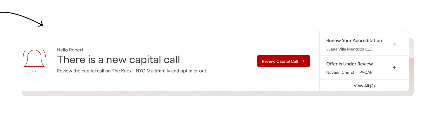
There were 16 different action banners created. Here are few examples:
There were 16 different action banners created. Here are few examples:
There were 16 different action banners created. Here are few examples:




Projects

Tax Center
Investor support tickets were reduced by 50% and
the CSAT score increased by 8%Read Project

Offer Dashboard
B2B dashboard that reduced the average time on task by 50%
Read Project
Logged in Homepage
4× increase in engagement within the Investment Opportunities section and a 63% increase in users entering the account opening flow.
Read Project

Portfolio
The views of the quarterly report increased by 30% and the CSAT score increased by 7%
Read Project

Account Creation
Design focused on increasing the amount of accounts
opened and submittedRead Project

Navigation
Navigation redesign of an investment platform
Read Project
Tax Center
Investor support tickets were reduced by 50% and
the CSAT score increased by 8%Read Project
Offer Dashboard
B2B dashboard that reduced the average time on task by 50%
Read Project
Logged in Homepage
4× increase in engagement within the Investment Opportunities section and a 63% increase in users entering the account opening flow.
Read Project
Portfolio
The views of the quarterly report increased by 30% and the CSAT score increased by 7%
Read Project
Account Creation
Design focused on increasing the amount of accounts
opened and submittedRead Project
Navigation
Navigation redesign of an investment platform
Read Project
Tax Center
Investor support tickets were reduced by 50% and
the CSAT score increased by 8%Read Project
Offer Dashboard
B2B dashboard that reduced the average time on task by 50%
Read Project
Logged in Homepage
4× increase in engagement within the Investment Opportunities section and a 63% increase in users entering the account opening flow.
Read Project
Portfolio
The views of the quarterly report increased by 30% and the CSAT score increased by 7%
Read Project
Account Creation
Design focused on increasing the amount of accounts
opened and submittedRead Project
Navigation
Navigation redesign of an investment platform
Read Project
Tax Center
Investor support tickets were reduced by 50% and
the CSAT score increased by 8%Read Project
Offer Dashboard
B2B dashboard that reduced the average time on task by 50%
Read Project
Logged in Homepage
4× increase in engagement within the Investment Opportunities section and a 63% increase in users entering the account opening flow.
Read Project
Portfolio
The views of the quarterly report increased by 30% and the CSAT score increased by 7%
Read Project
Account Creation
Design focused on increasing the amount of accounts
opened and submittedRead Project
Navigation
Navigation redesign of an investment platform
Read Project
Projects
Tax Center
Investor support tickets were reduced by 50% and
the CSAT score increased by 8%Read Project
Offer Dashboard
B2B dashboard that reduced the average time on task by 50%
Read Project
Logged in Homepage
4× increase in engagement within the Investment Opportunities section and a 63% increase in users entering the account opening flow.
Read Project
Portfolio
The views of the quarterly report increased by 30% and the CSAT score increased by 7%
Read Project
Account Creation
Design focused on increasing the amount of accounts
opened and submittedRead Project
Navigation
Navigation redesign of an investment platform
Read Project
Tax Center
Investor support tickets were reduced by 50% and
the CSAT score increased by 8%Read Project
Offer Dashboard
B2B dashboard that reduced the average time on task by 50%
Read Project
Logged in Homepage
4× increase in engagement within the Investment Opportunities section and a 63% increase in users entering the account opening flow.
Read Project
Portfolio
The views of the quarterly report increased by 30% and the CSAT score increased by 7%
Read Project
Account Creation
Design focused on increasing the amount of accounts
opened and submittedRead Project
Navigation
Navigation redesign of an investment platform
Read Project
Tax Center
Investor support tickets were reduced by 50% and
the CSAT score increased by 8%Read Project
Offer Dashboard
B2B dashboard that reduced the average time on task by 50%
Read Project
Logged in Homepage
4× increase in engagement within the Investment Opportunities section and a 63% increase in users entering the account opening flow.
Read Project
Portfolio
The views of the quarterly report increased by 30% and the CSAT score increased by 7%
Read Project
Account Creation
Design focused on increasing the amount of accounts
opened and submittedRead Project
Navigation
Navigation redesign of an investment platform
Read Project
Tax Center
Investor support tickets were reduced by 50% and
the CSAT score increased by 8%Read Project
Offer Dashboard
B2B dashboard that reduced the average time on task by 50%
Read Project
Logged in Homepage
4× increase in engagement within the Investment Opportunities section and a 63% increase in users entering the account opening flow.
Read Project
Portfolio
The views of the quarterly report increased by 30% and the CSAT score increased by 7%
Read Project
Account Creation
Design focused on increasing the amount of accounts
opened and submittedRead Project
Navigation
Navigation redesign of an investment platform
Read Project
Projects
Tax Center
Investor support tickets were reduced by 50% and
the CSAT score increased by 8%Read Project
Offer Dashboard
B2B dashboard that reduced the average time on task by 50%
Read Project
Logged in Homepage
4× increase in engagement within the Investment Opportunities section and a 63% increase in users entering the account opening flow.
Read Project
Portfolio
The views of the quarterly report increased by 30% and the CSAT score increased by 7%
Read Project
Account Creation
Design focused on increasing the amount of accounts
opened and submittedRead Project
Navigation
Navigation redesign of an investment platform
Read Project
Tax Center
Investor support tickets were reduced by 50% and
the CSAT score increased by 8%Read Project
Offer Dashboard
B2B dashboard that reduced the average time on task by 50%
Read Project
Logged in Homepage
4× increase in engagement within the Investment Opportunities section and a 63% increase in users entering the account opening flow.
Read Project
Portfolio
The views of the quarterly report increased by 30% and the CSAT score increased by 7%
Read Project
Account Creation
Design focused on increasing the amount of accounts
opened and submittedRead Project
Navigation
Navigation redesign of an investment platform
Read Project
Tax Center
Investor support tickets were reduced by 50% and
the CSAT score increased by 8%Read Project
Offer Dashboard
B2B dashboard that reduced the average time on task by 50%
Read Project
Logged in Homepage
4× increase in engagement within the Investment Opportunities section and a 63% increase in users entering the account opening flow.
Read Project
Portfolio
The views of the quarterly report increased by 30% and the CSAT score increased by 7%
Read Project
Account Creation
Design focused on increasing the amount of accounts
opened and submittedRead Project
Navigation
Navigation redesign of an investment platform
Read Project
Tax Center
Investor support tickets were reduced by 50% and
the CSAT score increased by 8%Read Project
Offer Dashboard
B2B dashboard that reduced the average time on task by 50%
Read Project
Logged in Homepage
4× increase in engagement within the Investment Opportunities section and a 63% increase in users entering the account opening flow.
Read Project
Portfolio
The views of the quarterly report increased by 30% and the CSAT score increased by 7%
Read Project
Account Creation
Design focused on increasing the amount of accounts
opened and submittedRead Project
Navigation
Navigation redesign of an investment platform
Read Project