Portfolio
Portfolio
Role: UX/UI Designer & Researcher
Technique: Session recordings & Moderated Testing
Role: UX/UI Designer & Researcher
Technique: Session recordings & Moderated Testing
Role: UX/UI Designer & Researcher
Technique: Session recordings & Moderated Testing

EXECUTIVE SUMMARY
The previous portfolio experience lacked clarity and contained several usability issues, making it difficult for investors to locate key information—such as reports, investments, and recent transactions—or gain a clear understanding of their overall portfolio.
To better understand these challenges, I analyzed user session recordings and met with the Customer Care team to identify the most common pain points. Based on these insights, I collaborated with the Portfolio team to simplify both the data tables and visual graphs, improving information hierarchy and readability.
I then conducted 5 moderated usability tests, asking investors to locate specific elements and share feedback on clarity and ease of use. The redesigned experience delivered measurable results—a 30% increase in quarterly report views and a 7% improvement in CSAT, validating the impact of a more intuitive and user-centered portfolio design.
The previous portfolio experience lacked clarity and contained several usability issues, making it difficult for investors to locate key information—such as reports, investments, and recent transactions—or gain a clear understanding of their overall portfolio.
To better understand these challenges, I analyzed user session recordings and met with the Customer Care team to identify the most common pain points. Based on these insights, I collaborated with the Portfolio team to simplify both the data tables and visual graphs, improving information hierarchy and readability.
I then conducted 5 moderated usability tests, asking investors to locate specific elements and share feedback on clarity and ease of use. The redesigned experience delivered measurable results—a 30% increase in quarterly report views and a 7% improvement in CSAT, validating the impact of a more intuitive and user-centered portfolio design.
The previous portfolio experience lacked clarity and contained several usability issues, making it difficult for investors to locate key information—such as reports, investments, and recent transactions—or gain a clear understanding of their overall portfolio.
To better understand these challenges, I analyzed user session recordings and met with the Customer Care team to identify the most common pain points. Based on these insights, I collaborated with the Portfolio team to simplify both the data tables and visual graphs, improving information hierarchy and readability.
I then conducted 5 moderated usability tests, asking investors to locate specific elements and share feedback on clarity and ease of use. The redesigned experience delivered measurable results—a 30% increase in quarterly report views and a 7% improvement in CSAT, validating the impact of a more intuitive and user-centered portfolio design.
PROBLEM STATEMENT
Investors often struggled to locate key information—such as quarterly reports, portfolio details, and recent transactions—resulting in a volume of support tickets.
Investors often struggled to locate key information—such as quarterly reports, portfolio details, and recent transactions—resulting in a volume of support tickets.
Investors often struggled to locate key information—such as quarterly reports, portfolio details, and recent transactions—resulting in a volume of support tickets.
RESEARCH
Audit & Initial Findings
Audit & Initial Findings
Audit & Initial Findings
I examined available data in Google Analytics, Clarity recordings, and met with the customer care team to identify the main pain-points:
I examined available data in Google Analytics, Clarity recordings, and met with the customer care team to identify the main pain-points:
I examined available data in Google Analytics, Clarity recordings, and met with the customer care team to identify the main pain-points:


Most investors have only one investment account, yet they still need to expand a row to view their investments because the information is grouped by account—adding unnecessary steps.
The current graphs are difficult to interpret, and investors struggle to understand the data presented.
Investors often don't know where to find their latest quarterly report.
Based on Clarity records, investors need a quicker way to identify their most recent transactions
The tables present additional usability challenges:
They are too wide, and many investors don’t realize they can be scrolled horizontally.
When there are many investments, the table has a fixed height with a scrollable content area, making it difficult to locate a specific investment.
The "View Investor Room" link—currently the only way to access detailed investment information—is barely noticeable.
Most investors have only one investment account, yet they still need to expand a row to view their investments because the information is grouped by account—adding unnecessary steps.
The current graphs are difficult to interpret, and investors struggle to understand the data presented.
Investors often don't know where to find their latest quarterly report.
Based on Clarity records, investors need a quicker way to identify their most recent transactions
The tables present additional usability challenges:
They are too wide, and many investors don’t realize they can be scrolled horizontally.
When there are many investments, the table has a fixed height with a scrollable content area, making it difficult to locate a specific investment.
The "View Investor Room" link—currently the only way to access detailed investment information—is barely noticeable.
Most investors have only one investment account, yet they still need to expand a row to view their investments because the information is grouped by account—adding unnecessary steps.
The current graphs are difficult to interpret, and investors struggle to understand the data presented.
Investors often don't know where to find their latest quarterly report.
Based on Clarity records, investors need a quicker way to identify their most recent transactions
The tables present additional usability challenges:
They are too wide, and many investors don’t realize they can be scrolled horizontally.
When there are many investments, the table has a fixed height with a scrollable content area, making it difficult to locate a specific investment.
The "View Investor Room" link—currently the only way to access detailed investment information—is barely noticeable.
design iterations
Design explorations
Design explorations
Design explorations
I started by simplifying the page information by working with the Portfolio team to identify what information was needed to get an overview of the investment and overall Portfolio:
I started by simplifying the page information by working with the Portfolio team to identify what information was needed to get an overview of the investment and overall Portfolio:
I started by simplifying the page information by working with the Portfolio team to identify what information was needed to get an overview of the investment and overall Portfolio:

I conducted five moderated usability tests to evaluate how easily investors could navigate and interpret their portfolio data. For each session, I recreated the participant’s portfolio with similar investments and transaction details to ensure realistic scenarios. Participants were asked to locate specific investments and transactions, interpret graphs, and provide feedback on clarity, comprehension, and overall usability.
I conducted five moderated usability tests to evaluate how easily investors could navigate and interpret their portfolio data. For each session, I recreated the participant’s portfolio with similar investments and transaction details to ensure realistic scenarios. Participants were asked to locate specific investments and transactions, interpret graphs, and provide feedback on clarity, comprehension, and overall usability.
I conducted five moderated usability tests to evaluate how easily investors could navigate and interpret their portfolio data. For each session, I recreated the participant’s portfolio with similar investments and transaction details to ensure realistic scenarios. Participants were asked to locate specific investments and transactions, interpret graphs, and provide feedback on clarity, comprehension, and overall usability.

The usability tests revealed several opportunities:
Graph visibility: Investors wanted the ability to hide or show graphs, as they were not always useful to their workflow
Filtering and sorting: Participants requested options to sort by investment date, filter out divested assets, and search by investment name—critical features for users managing large portfolios (40+ investments).
Table density: Users with extensive portfolios found the row height too tall, requiring excessive scrolling to locate specific investments.
The usability tests revealed several opportunities:
Graph visibility: Investors wanted the ability to hide or show graphs, as they were not always useful to their workflow
Filtering and sorting: Participants requested options to sort by investment date, filter out divested assets, and search by investment name—critical features for users managing large portfolios (40+ investments).
Table density: Users with extensive portfolios found the row height too tall, requiring excessive scrolling to locate specific investments.
results
Project outcome
Project outcome
Project outcome
The CSAT score increased by 7%, the report views rose by 30%, and investors gained a better understanding of their portfolios—enabling them to identify data discrepancies that had previously gone unnoticed.
I consider it a success that investors began noticing errors in their portfolio data. These discrepancies existed before, but it wasn’t until the page’s usability was improved that investors were able to clearly interpret the information and spot inconsistencies.
The CSAT score increased by 7%, the report views rose by 30%, and investors gained a better understanding of their portfolios—enabling them to identify data discrepancies that had previously gone unnoticed.
I consider it a success that investors began noticing errors in their portfolio data. These discrepancies existed before, but it wasn’t until the page’s usability was improved that investors were able to clearly interpret the information and spot inconsistencies.
The CSAT score increased by 7%, the report views rose by 30%, and investors gained a better understanding of their portfolios—enabling them to identify data discrepancies that had previously gone unnoticed.
I consider it a success that investors began noticing errors in their portfolio data. These discrepancies existed before, but it wasn’t until the page’s usability was improved that investors were able to clearly interpret the information and spot inconsistencies.
30%
30%
Increased in views on the quarterly report
Increased in views on the quarterly report
7%
7%
Increased in CSAT score
Increased in CSAT score


Projects

Tax Center
Investor support tickets were reduced by 50% and
the CSAT score increased by 8%Read Project

Offer Dashboard
B2B dashboard that reduced the average time on task by 50%
Read Project
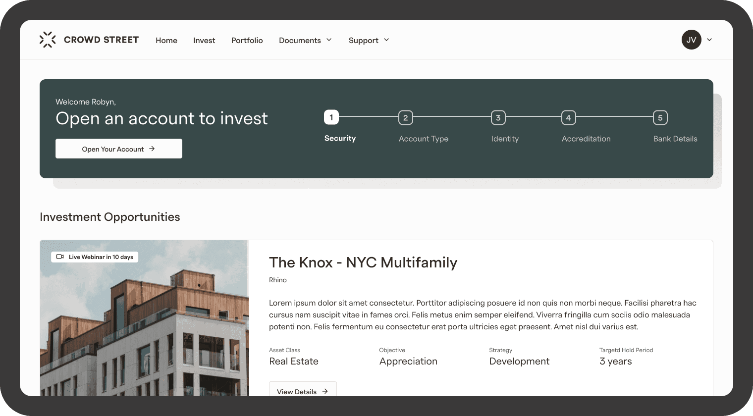
Logged in Homepage
4× increase in engagement within the Investment Opportunities section and a 63% increase in users entering the account opening flow.
Read Project

Portfolio
The views of the quarterly report increased by 30% and the CSAT score increased by 7%
Read Project

Account Creation
Design focused on increasing the amount of accounts
opened and submittedRead Project

Navigation
Navigation redesign of an investment platform
Read Project
Tax Center
Investor support tickets were reduced by 50% and
the CSAT score increased by 8%Read Project
Offer Dashboard
B2B dashboard that reduced the average time on task by 50%
Read Project
Logged in Homepage
4× increase in engagement within the Investment Opportunities section and a 63% increase in users entering the account opening flow.
Read Project
Portfolio
The views of the quarterly report increased by 30% and the CSAT score increased by 7%
Read Project
Account Creation
Design focused on increasing the amount of accounts
opened and submittedRead Project
Navigation
Navigation redesign of an investment platform
Read Project
Tax Center
Investor support tickets were reduced by 50% and
the CSAT score increased by 8%Read Project
Offer Dashboard
B2B dashboard that reduced the average time on task by 50%
Read Project
Logged in Homepage
4× increase in engagement within the Investment Opportunities section and a 63% increase in users entering the account opening flow.
Read Project
Portfolio
The views of the quarterly report increased by 30% and the CSAT score increased by 7%
Read Project
Account Creation
Design focused on increasing the amount of accounts
opened and submittedRead Project
Navigation
Navigation redesign of an investment platform
Read Project
Tax Center
Investor support tickets were reduced by 50% and
the CSAT score increased by 8%Read Project
Offer Dashboard
B2B dashboard that reduced the average time on task by 50%
Read Project
Logged in Homepage
4× increase in engagement within the Investment Opportunities section and a 63% increase in users entering the account opening flow.
Read Project
Portfolio
The views of the quarterly report increased by 30% and the CSAT score increased by 7%
Read Project
Account Creation
Design focused on increasing the amount of accounts
opened and submittedRead Project
Navigation
Navigation redesign of an investment platform
Read Project
Projects
Tax Center
Investor support tickets were reduced by 50% and
the CSAT score increased by 8%Read Project
Offer Dashboard
B2B dashboard that reduced the average time on task by 50%
Read Project
Logged in Homepage
4× increase in engagement within the Investment Opportunities section and a 63% increase in users entering the account opening flow.
Read Project
Portfolio
The views of the quarterly report increased by 30% and the CSAT score increased by 7%
Read Project
Account Creation
Design focused on increasing the amount of accounts
opened and submittedRead Project
Navigation
Navigation redesign of an investment platform
Read Project
Tax Center
Investor support tickets were reduced by 50% and
the CSAT score increased by 8%Read Project
Offer Dashboard
B2B dashboard that reduced the average time on task by 50%
Read Project
Logged in Homepage
4× increase in engagement within the Investment Opportunities section and a 63% increase in users entering the account opening flow.
Read Project
Portfolio
The views of the quarterly report increased by 30% and the CSAT score increased by 7%
Read Project
Account Creation
Design focused on increasing the amount of accounts
opened and submittedRead Project
Navigation
Navigation redesign of an investment platform
Read Project
Tax Center
Investor support tickets were reduced by 50% and
the CSAT score increased by 8%Read Project
Offer Dashboard
B2B dashboard that reduced the average time on task by 50%
Read Project
Logged in Homepage
4× increase in engagement within the Investment Opportunities section and a 63% increase in users entering the account opening flow.
Read Project
Portfolio
The views of the quarterly report increased by 30% and the CSAT score increased by 7%
Read Project
Account Creation
Design focused on increasing the amount of accounts
opened and submittedRead Project
Navigation
Navigation redesign of an investment platform
Read Project
Tax Center
Investor support tickets were reduced by 50% and
the CSAT score increased by 8%Read Project
Offer Dashboard
B2B dashboard that reduced the average time on task by 50%
Read Project
Logged in Homepage
4× increase in engagement within the Investment Opportunities section and a 63% increase in users entering the account opening flow.
Read Project
Portfolio
The views of the quarterly report increased by 30% and the CSAT score increased by 7%
Read Project
Account Creation
Design focused on increasing the amount of accounts
opened and submittedRead Project
Navigation
Navigation redesign of an investment platform
Read Project
Projects
Tax Center
Investor support tickets were reduced by 50% and
the CSAT score increased by 8%Read Project
Offer Dashboard
B2B dashboard that reduced the average time on task by 50%
Read Project
Logged in Homepage
4× increase in engagement within the Investment Opportunities section and a 63% increase in users entering the account opening flow.
Read Project
Portfolio
The views of the quarterly report increased by 30% and the CSAT score increased by 7%
Read Project
Account Creation
Design focused on increasing the amount of accounts
opened and submittedRead Project
Navigation
Navigation redesign of an investment platform
Read Project
Tax Center
Investor support tickets were reduced by 50% and
the CSAT score increased by 8%Read Project
Offer Dashboard
B2B dashboard that reduced the average time on task by 50%
Read Project
Logged in Homepage
4× increase in engagement within the Investment Opportunities section and a 63% increase in users entering the account opening flow.
Read Project
Portfolio
The views of the quarterly report increased by 30% and the CSAT score increased by 7%
Read Project
Account Creation
Design focused on increasing the amount of accounts
opened and submittedRead Project
Navigation
Navigation redesign of an investment platform
Read Project
Tax Center
Investor support tickets were reduced by 50% and
the CSAT score increased by 8%Read Project
Offer Dashboard
B2B dashboard that reduced the average time on task by 50%
Read Project
Logged in Homepage
4× increase in engagement within the Investment Opportunities section and a 63% increase in users entering the account opening flow.
Read Project
Portfolio
The views of the quarterly report increased by 30% and the CSAT score increased by 7%
Read Project
Account Creation
Design focused on increasing the amount of accounts
opened and submittedRead Project
Navigation
Navigation redesign of an investment platform
Read Project
Tax Center
Investor support tickets were reduced by 50% and
the CSAT score increased by 8%Read Project
Offer Dashboard
B2B dashboard that reduced the average time on task by 50%
Read Project
Logged in Homepage
4× increase in engagement within the Investment Opportunities section and a 63% increase in users entering the account opening flow.
Read Project
Portfolio
The views of the quarterly report increased by 30% and the CSAT score increased by 7%
Read Project
Account Creation
Design focused on increasing the amount of accounts
opened and submittedRead Project
Navigation
Navigation redesign of an investment platform
Read Project