Offer Dashboard
Offer Dashboard
Role: UX/UI Designer & Researcher
Technique: Personas, Journey Map, How might we, Crazy 8's,
Moderated Testing
Role: UX/UI Designer & Researcher
Technique: Personas, Journey Map, How might we, Crazy 8's,
Moderated Testing
Role: UX/UI Designer & Researcher
Technique: Personas, Journey Map, How might we, Crazy 8's,
Moderated Testing

EXECUTIVE SUMMARY
Crowd Street users invest in commercial real estate projects. The real estate employees must review and approve hundreds of offers to verify documentation, confirm payments, and finalize contracts.
The previous offer approval workflow was highly unintuitive. Employees relied heavily on one-on-one support to remember the correct steps, filters, and task sequences. I conducted a personas workshop to understand the key personas, their goals, and pain points. I also conducted a user journey map to further understand the current end-to-end workflow and uncover usability gaps. Furthermore, I facilitated a “How Might We” + Crazy 8’s brainstorming sessions to simplify the offer approval flow. Lastly, I interviewed real estate employees to refine the new design interactions and layout.
The redesign reduced the average time on task by 50%, significantly improving efficiency and clarity. Additionally, the new “Approve Document” component proved highly adaptable, being successfully implemented across another three different projects, demonstrating its scalability and design versatility.
Crowd Street users invest in commercial real estate projects. Real estate employees must review and approve hundreds of offers to verify documentation, confirm payments, and finalize contracts.
The previous offer approval workflow was highly unintuitive. Employees relied heavily on one-on-one support to remember the correct steps, filters, and task sequences. I conducted a personas workshop to understand the four key personas, their goals, and pain points. I also conducted a user journey map to further understand the current end-to-end workflow and uncover usability gaps. Furthermore, I facilitated a “How Might We” + Crazy 8’s brainstorming sessions to simplify the offer approval flow. Lastly, I interviewed real estate employees to refine the new design interactions and layout.
The redesign reduced the average time on task by 50% , significantly improving efficiency and clarity. Additionally, the new “Approve Document” component proved highly adaptable, being successfully implemented across another three different projects, demonstrating its scalability and design versatility.
Crowd Street users invest in commercial real estate projects. Real estate employees must review and approve hundreds of offers to verify documentation, confirm payments, and finalize contracts.
The previous offer approval workflow was highly unintuitive. Employees relied heavily on one-on-one support to remember the correct steps, filters, and task sequences. I conducted a personas workshop to understand the key personas, their goals, and pain points. I also conducted a user journey map to further understand the current end-to-end workflow and uncover usability gaps. Furthermore, I facilitated a “How Might We” + Crazy 8’s brainstorming sessions to simplify the offer approval flow. Lastly, I interviewed real estate employees to refine the new design interactions and layout.
The redesign reduced the average time on task by 50%, significantly improving efficiency and clarity. Additionally, the new “Approve Document” component proved highly adaptable, being successfully implemented across another three different projects, demonstrating its scalability and design versatility.
PROBLEM STATEMENT
CrowdStreet partners with real estate firms to list investment opportunities on its platform. Each project attracts hundreds of offers that must be reviewed and approved by the real estate team.
However, the offer approval workflow lacked clarity and intuitiveness, creating friction for users. Employees needed prior knowledge of the process—including which steps to follow, filters to apply, and the correct sequence of tasks—before they could complete their work. The interface relied heavily on long instructional text blocks, which contributed to cognitive overload and visual clutter.
As a result, users frequently experienced confusion and depended on manual guidance and one-on-one support to navigate the system, indicating significant usability and information architecture challenges within the workflow.
CrowdStreet partners with real estate firms to list investment opportunities on its platform. Each project attracts hundreds of offers that must be reviewed and approved by the real estate team.
However, the offer approval workflow lacked clarity and intuitiveness, creating friction for users. Employees needed prior knowledge of the process—including which steps to follow, filters to apply, and the correct sequence of tasks—before they could complete their work. The interface relied heavily on long instructional text blocks, which contributed to cognitive overload and visual clutter.
As a result, users frequently experienced confusion and depended on manual guidance and one-on-one support to navigate the system, indicating significant usability and information architecture challenges within the workflow.
CrowdStreet partners with real estate firms to list investment opportunities on its platform. Each project attracts hundreds of offers that must be reviewed and approved by the real estate team.
However, the offer approval workflow lacked clarity and intuitiveness, creating friction for users. Employees needed prior knowledge of the process—including which steps to follow, filters to apply, and the correct sequence of tasks—before they could complete their work. The interface relied heavily on long instructional text blocks, which contributed to cognitive overload and visual clutter.
As a result, users frequently experienced confusion and depended on manual guidance and one-on-one support to navigate the system, indicating significant usability and information architecture challenges within the workflow.
RESEARCH
Audit & Initial Findings
Audit & Initial Findings
Audit & Initial Findings
I began by reviewing the existing flow to identify basic usability issues, check any metrics available, and met with the sponsor care team to understand the most common issues. Based on my evaluation and experience, I identified several key problems:
I began by reviewing the existing flow to identify basic usability issues, check any metrics available, and met with the sponsor care team to understand the most common issues. Based on my evaluation and experience, I identified several key problems:
I began by reviewing the existing flow to identify basic usability issues, check any metrics available, and met with the sponsor care team to understand the most common issues. Based on my evaluation and experience, I identified several key problems:


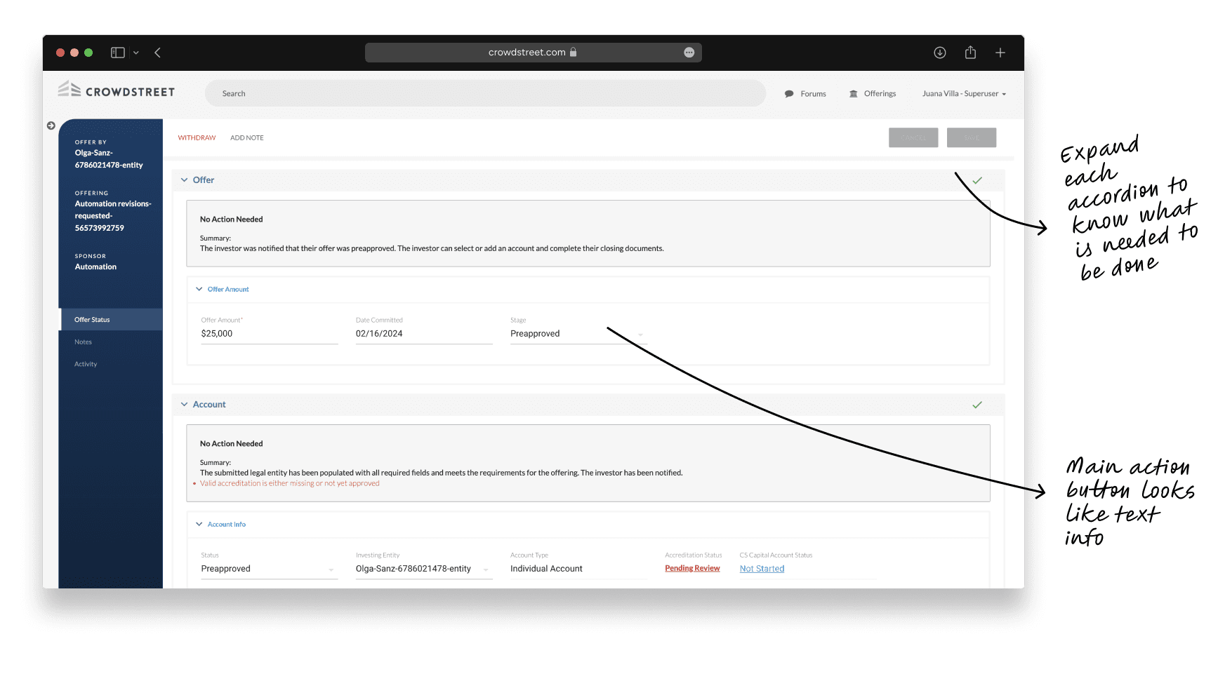
Finding the page to manage offers was very hard to find. They had to click on Offerings & Investments > Offerings > View Offering > Manage Offers > View each offer
Users were required to know before hand which tables to use, filters to apply, and follow a specific sequence of tasks.
The page contained lengthy instructional paragraphs, contributing to a cluttered and confusing interface.
Users right clicked on each file to open it on a new tab and adjust their screens to fit the two windows in the screen. That way they could review the information in the document uploaded with the information entered in the form.
It is very difficult how to approve or request updates to each offer
Finding the page to manage offers was very hard to find. They had to click on Offerings & Investments > Offerings > View Offering > Manage Offers > View each offer
Users were required to know before hand which tables to use, filters to apply, and follow a specific sequence of tasks.
The page contained lengthy instructional paragraphs, contributing to a cluttered and confusing interface.
Users right clicked on each file to open it on a new tab and adjust their screens to fit the two windows in the screen. That way they could review the information in the document uploaded with the information entered in the form.
It is very difficult how to approve or request updates to each offer
Cross-Functional Alignment
Cross-Functional Alignment
Cross-Functional Alignment
I facilitated multiple workshops to understand better the user needs, and how the flow should look like:
Persona Workshop. We identify the four distinct personas that manage the offers and their specific needs and responsabilities when managing offers.
I facilitated multiple workshops to understand better the user needs, and how the flow should look like:
Persona Workshop. We identify the four distinct personas that manage the offers and their specific needs and responsabilities when managing offers.


Current User Journey Map. To understand the existing experience, I conducted interviews with the Sponsor Care team to document the end-to-end workflow real estate employees follow when reviewing offers. I then mapped the current user journey, detailing:
The personas involved at each stage
The steps and actions required to complete key tasks
The associated pain points and opportunities for improvement
During the collaborative workshop, the Sponsor Care team helped validate and expand the identified pain points and opportunities, providing deeper insights into the real challenges users face and uncovering areas where design could deliver the greatest impact.

“How Might We” and Crazy 8’s. During this workshop, the team collaboratively explored ways to enhance the user journey. We reframed pain points into design opportunities using the “How Might We” method and then used the Crazy 8’s exercise to rapidly visualize potential layout and interaction solutions. This session generated a wide range of creative ideas that informed the next stage of concept development.


design iterations & Testing
Design explorations
Design explorations
Design explorations
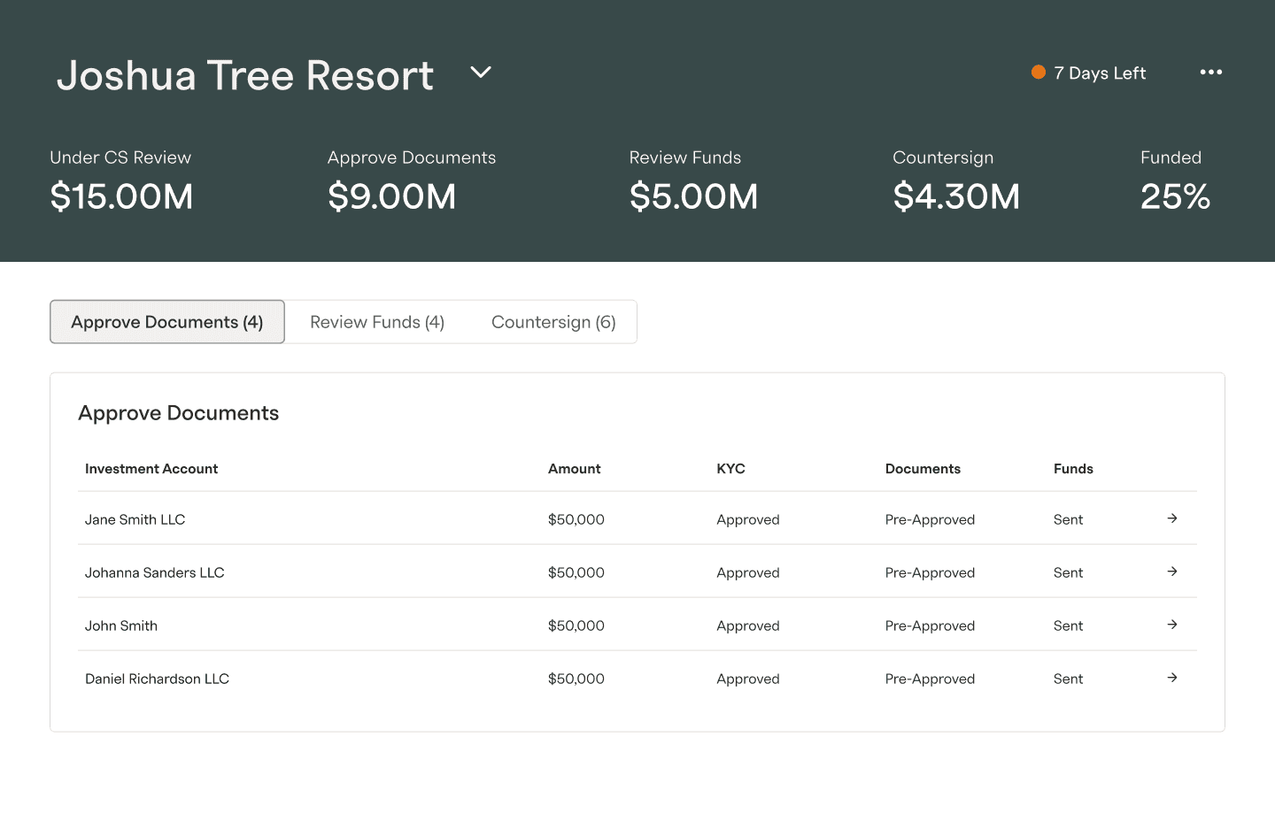
Each offer progresses through multiple stages, with specific actions assigned to different user personas. In the previous workflow, users were required to open individual offers to determine which stages were incomplete and identify their next responsibilities. This approach created unnecessary cognitive load and slowed task completion.
The redesign explorations introduced a new mental model that surfaces offer stages more transparently. By displaying all offers grouped by stage, users could easily identify pending tasks within their responsibility and manage them more efficiently:
Each offer progresses through multiple stages, with specific actions assigned to different user personas. In the previous workflow, users were required to open individual offers to determine which stages were incomplete and identify their next responsibilities. This approach created unnecessary cognitive load and slowed task completion.
The redesign explorations introduced a new mental model that surfaces offer stages more transparently. By displaying all offers grouped by stage, users could easily identify pending tasks within their responsibility and manage them more efficiently:
Each offer progresses through multiple stages, with specific actions assigned to different user personas. In the previous workflow, users were required to open individual offers to determine which stages were incomplete and identify their next responsibilities. This approach created unnecessary cognitive load and slowed task completion.
The redesign explorations introduced a new mental model that surfaces offer stages more transparently. By displaying all offers grouped by stage, users could easily identify pending tasks within their responsibility and manage them more efficiently:

Each action was intentionally designed to be distinct, allowing users to quickly recognize and process different types of tasks.
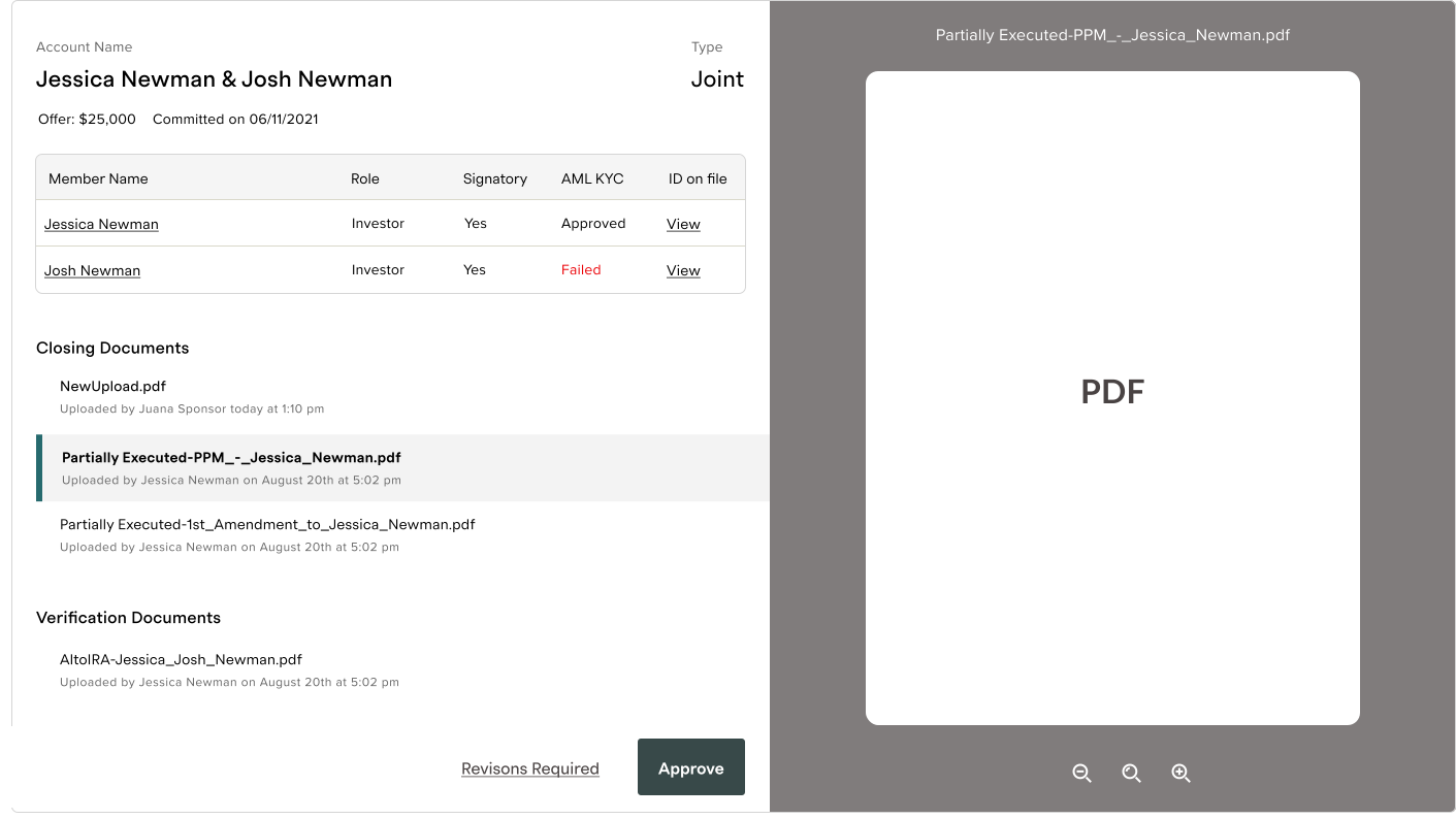
To streamline document approval, the page is divided into two columns, making it easy to toggle between documents and verify that the entered information matches the information in the uploaded documents:
Each action was intentionally designed to be distinct, allowing users to quickly recognize and process different types of tasks.
To streamline document approval, the page is divided into two columns, making it easy to toggle between documents and verify that the entered information matches the information in the uploaded documents:
Each action was intentionally designed to be distinct, allowing users to quickly recognize and process different types of tasks.
To streamline document approval, the page is divided into two columns, making it easy to toggle between documents and verify that the entered information matches the information in the uploaded documents:

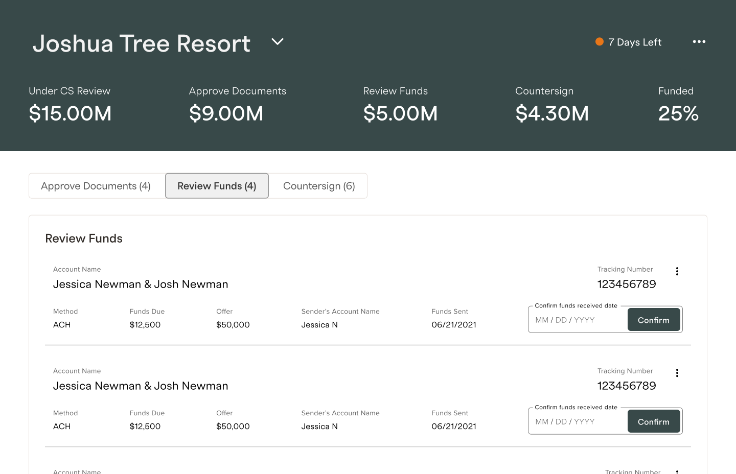
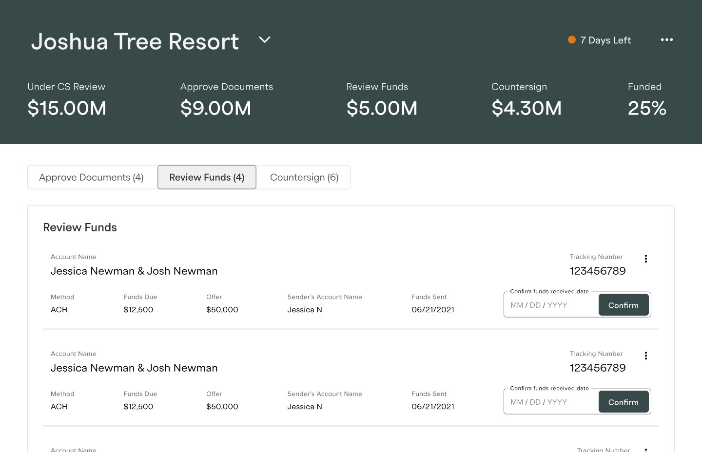
To optimize the Review Funds step, the interface displays only the essential information required to verify receipt of funds. A clear, prominent action button allows users to easily confirm that the funds have been received, reducing cognitive load and improving task efficiency:
To optimize the Review Funds step, the interface displays only the essential information required to verify receipt of funds. A clear, prominent action button allows users to easily confirm that the funds have been received, reducing cognitive load and improving task efficiency:
To optimize the Review Funds step, the interface displays only the essential information required to verify receipt of funds. A clear, prominent action button allows users to easily confirm that the funds have been received, reducing cognitive load and improving task efficiency:

User interviews
User interviews
User interviews
Facilitated user interviews with real estate employees. They were asked to perform the tasks required by their role and any usability issue or request were noted.
After these interviews, the following updates were done:
Add a tab to view all offers regardless of stage
Add a search
Some labels and data fields were updated
Facilitated user interviews with real estate employees. They were asked to perform the tasks required by their role and any usability issue or request were noted.
After these interviews, the following updates were done:
Add a tab to view all offers regardless of stage
Add a search
Some labels and data fields were updated
Facilitated user interviews with real estate employees. They were asked to perform the tasks required by their role and any usability issue or request were noted.
After these interviews, the following updates were done:
Add a tab to view all offers regardless of stage
Add a search
Some labels and data fields were updated
results
Project outcome
Project outcome
Project outcome
The average time spent on each task was reduced by 50%. Furthermore, the "Approve Document" tab design has been utilized across three distinct projects, highlighting the adaptability and versatility of this design.
These are some sponsor employee feedback after launch:
The average time spent on each task was reduced by 50%. Furthermore, the "Approve Document" tab design has been utilized across three distinct projects, highlighting the adaptability and versatility of this design.
These are some sponsor employee feedback after launch:
The average time spent on each task was reduced by 50%. Furthermore, the "Approve Document" tab design has been utilized across three distinct projects, highlighting the adaptability and versatility of this design.
These are some sponsor employee feedback after launch:

"It is great! This is the flow that I was expected to see... It streamline my process significantly"
"It is great! This is the flow that I was expected to see... It streamline my process significantly"
Tax Compliance
Real estate sponsor

"WOW! This is awesome!"
"WOW! This is awesome!"
Post Investment Group
Real estate sponsor


"It is great! This is the flow that I was expected to see... It streamline my process significantly"
Tax Compliance
Sponsor
"WOW! This is awesome!"
Post Investment Group
Sponsor
Projects

Tax Center
Investor support tickets were reduced by 50% and
the CSAT score increased by 8%Read Project

Offer Dashboard
B2B dashboard that reduced the average time on task by 50%
Read Project
Logged in Homepage
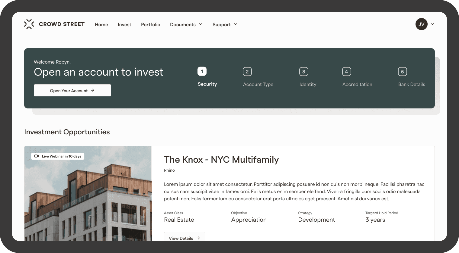
4× increase in engagement within the Investment Opportunities section and a 63% increase in users entering the account opening flow.
Read Project

Portfolio
The views of the quarterly report increased by 30% and the CSAT score increased by 7%
Read Project

Account Creation
Design focused on increasing the amount of accounts
opened and submittedRead Project

Navigation
Navigation redesign of an investment platform
Read Project
Tax Center
Investor support tickets were reduced by 50% and
the CSAT score increased by 8%Read Project
Offer Dashboard
B2B dashboard that reduced the average time on task by 50%
Read Project
Logged in Homepage
4× increase in engagement within the Investment Opportunities section and a 63% increase in users entering the account opening flow.
Read Project
Portfolio
The views of the quarterly report increased by 30% and the CSAT score increased by 7%
Read Project
Account Creation
Design focused on increasing the amount of accounts
opened and submittedRead Project
Navigation
Navigation redesign of an investment platform
Read Project
Tax Center
Investor support tickets were reduced by 50% and
the CSAT score increased by 8%Read Project
Offer Dashboard
B2B dashboard that reduced the average time on task by 50%
Read Project
Logged in Homepage
4× increase in engagement within the Investment Opportunities section and a 63% increase in users entering the account opening flow.
Read Project
Portfolio
The views of the quarterly report increased by 30% and the CSAT score increased by 7%
Read Project
Account Creation
Design focused on increasing the amount of accounts
opened and submittedRead Project
Navigation
Navigation redesign of an investment platform
Read Project
Tax Center
Investor support tickets were reduced by 50% and
the CSAT score increased by 8%Read Project
Offer Dashboard
B2B dashboard that reduced the average time on task by 50%
Read Project
Logged in Homepage
4× increase in engagement within the Investment Opportunities section and a 63% increase in users entering the account opening flow.
Read Project
Portfolio
The views of the quarterly report increased by 30% and the CSAT score increased by 7%
Read Project
Account Creation
Design focused on increasing the amount of accounts
opened and submittedRead Project
Navigation
Navigation redesign of an investment platform
Read Project
Projects
Tax Center
Investor support tickets were reduced by 50% and
the CSAT score increased by 8%Read Project
Offer Dashboard
B2B dashboard that reduced the average time on task by 50%
Read Project
Logged in Homepage
4× increase in engagement within the Investment Opportunities section and a 63% increase in users entering the account opening flow.
Read Project
Portfolio
The views of the quarterly report increased by 30% and the CSAT score increased by 7%
Read Project
Account Creation
Design focused on increasing the amount of accounts
opened and submittedRead Project
Navigation
Navigation redesign of an investment platform
Read Project
Tax Center
Investor support tickets were reduced by 50% and
the CSAT score increased by 8%Read Project
Offer Dashboard
B2B dashboard that reduced the average time on task by 50%
Read Project
Logged in Homepage
4× increase in engagement within the Investment Opportunities section and a 63% increase in users entering the account opening flow.
Read Project
Portfolio
The views of the quarterly report increased by 30% and the CSAT score increased by 7%
Read Project
Account Creation
Design focused on increasing the amount of accounts
opened and submittedRead Project
Navigation
Navigation redesign of an investment platform
Read Project
Tax Center
Investor support tickets were reduced by 50% and
the CSAT score increased by 8%Read Project
Offer Dashboard
B2B dashboard that reduced the average time on task by 50%
Read Project
Logged in Homepage
4× increase in engagement within the Investment Opportunities section and a 63% increase in users entering the account opening flow.
Read Project
Portfolio
The views of the quarterly report increased by 30% and the CSAT score increased by 7%
Read Project
Account Creation
Design focused on increasing the amount of accounts
opened and submittedRead Project
Navigation
Navigation redesign of an investment platform
Read Project
Tax Center
Investor support tickets were reduced by 50% and
the CSAT score increased by 8%Read Project
Offer Dashboard
B2B dashboard that reduced the average time on task by 50%
Read Project
Logged in Homepage
4× increase in engagement within the Investment Opportunities section and a 63% increase in users entering the account opening flow.
Read Project
Portfolio
The views of the quarterly report increased by 30% and the CSAT score increased by 7%
Read Project
Account Creation
Design focused on increasing the amount of accounts
opened and submittedRead Project
Navigation
Navigation redesign of an investment platform
Read Project
Projects
Tax Center
Investor support tickets were reduced by 50% and
the CSAT score increased by 8%Read Project
Offer Dashboard
B2B dashboard that reduced the average time on task by 50%
Read Project
Logged in Homepage
4× increase in engagement within the Investment Opportunities section and a 63% increase in users entering the account opening flow.
Read Project
Portfolio
The views of the quarterly report increased by 30% and the CSAT score increased by 7%
Read Project
Account Creation
Design focused on increasing the amount of accounts
opened and submittedRead Project
Navigation
Navigation redesign of an investment platform
Read Project
Tax Center
Investor support tickets were reduced by 50% and
the CSAT score increased by 8%Read Project
Offer Dashboard
B2B dashboard that reduced the average time on task by 50%
Read Project
Logged in Homepage
4× increase in engagement within the Investment Opportunities section and a 63% increase in users entering the account opening flow.
Read Project
Portfolio
The views of the quarterly report increased by 30% and the CSAT score increased by 7%
Read Project
Account Creation
Design focused on increasing the amount of accounts
opened and submittedRead Project
Navigation
Navigation redesign of an investment platform
Read Project
Tax Center
Investor support tickets were reduced by 50% and
the CSAT score increased by 8%Read Project
Offer Dashboard
B2B dashboard that reduced the average time on task by 50%
Read Project
Logged in Homepage
4× increase in engagement within the Investment Opportunities section and a 63% increase in users entering the account opening flow.
Read Project
Portfolio
The views of the quarterly report increased by 30% and the CSAT score increased by 7%
Read Project
Account Creation
Design focused on increasing the amount of accounts
opened and submittedRead Project
Navigation
Navigation redesign of an investment platform
Read Project
Tax Center
Investor support tickets were reduced by 50% and
the CSAT score increased by 8%Read Project
Offer Dashboard
B2B dashboard that reduced the average time on task by 50%
Read Project
Logged in Homepage
4× increase in engagement within the Investment Opportunities section and a 63% increase in users entering the account opening flow.
Read Project
Portfolio
The views of the quarterly report increased by 30% and the CSAT score increased by 7%
Read Project
Account Creation
Design focused on increasing the amount of accounts
opened and submittedRead Project
Navigation
Navigation redesign of an investment platform
Read Project